The Creator’s Top 3 features of the Zone System Express
I know, I know, I am a little biased to the Zone System Express because I created it. It feels kind of silly, like a grade school teachers whose favorite kid in the class is their own, but hey, at least they have a favorite right?
All jokes aside, I wanted to put together a video for you that outlines my favorite features of the new Zone System Express 5.0. While I do have many favorites, I had to narrow this down to three or I would have made a 4-hour video and no one has time for that 🙂
The last Zone System Express release was version 4.0 in September of last year. I thought that release was pretty darn good at the time. I thought, heck, what can I do to top this one? Well, here are my three favorites. You can read about them here, or scroll down to the bottom of the post to watch the video tutorial to get a better understanding of them.
Learn More about the Zone System Express 5.0
1. The User Interface
If you know me well enough, you know my mantra that there is always something better, always room for improvement, and nothing is truly perfect. So I hit the drawing board, and I started learning a LOT more about javascript, HTML, and CSS coding. Through my research, I found that I could do quite a bit to this panel to improve the functionality on the backend. Some things you won’t even notice because they are all hidden behind ones and zeros, while others are obvious. Either way, the new User Interface is fancier, faster, and just a darn pretty site to look at 🙂
2. The 5 and 7 Tone Heat Maps
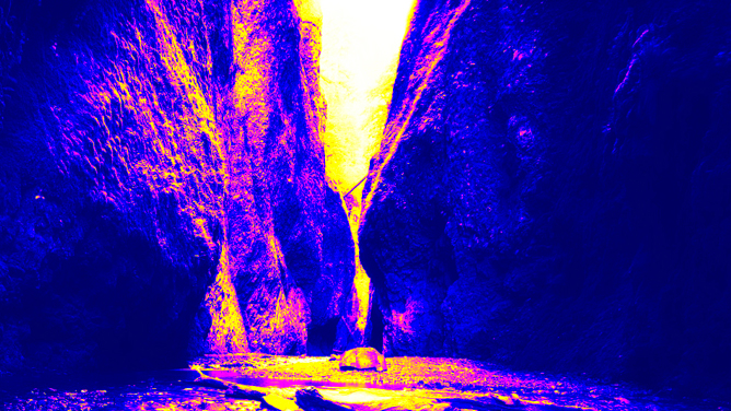
I did a tutorial on the Heat Maps a few months back. The sneaky thing is, I had already had it coded into the new panel even back then. However, I wasn’t quite ready for a ZSE5 release. I had a few things to figure out, like where am I going to put a whole new folder to house this thing? I, in turn, took out the Export tab and made a whole new panel for proofing and exporting to make room for the heat maps.
I think they are critical in image processing as they allow you to see tones in a way I have never experienced. With a simple gradient map, it shows you where your tones are in the image, but the kicker is the curve that is under it. For once, it is so much easier for me to show you how to SEE tones. That is because the heat maps make those tonal values appear as colors. This, I thought was going to be my favorite new feature… until #3.

3. The Enhanced Contrast II
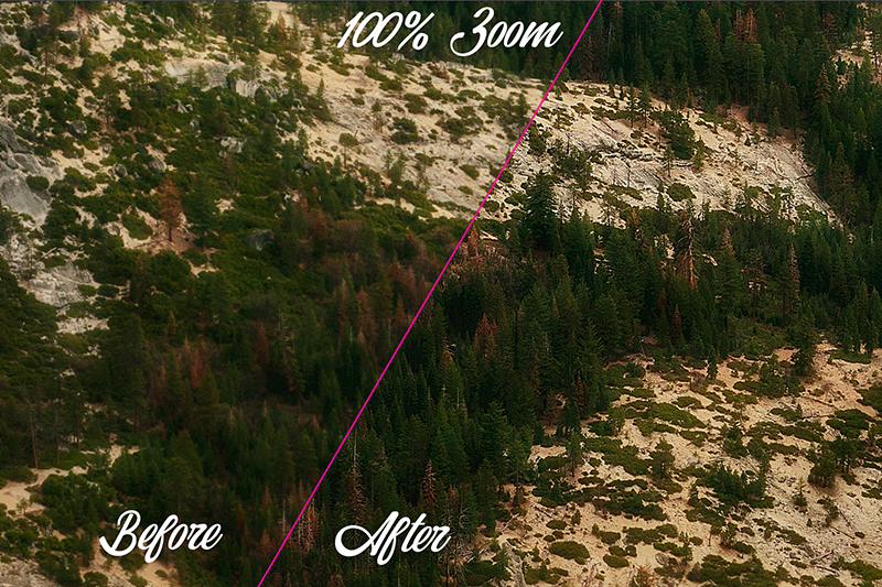
Enhanced COntrast II has been a button that has taken on many forms. Some may have seen that it has changed over time, others may not have noticed. Now, however, you will notice! I can guarantee you will never find detail optimizers anywhere on the planet like that of the Enhanced Contrast II button. It uses a combination of many things I have taught over the years, but in a very comprehensive way to give you a quick, lightweight approach to detail optimization like you have never seen. I was floored by the results the first time I used it. It can start out pretty heavy-handed, and it may appear to be a High Pass sharpening, but there are things going on before the High Pass that set you up for success. Try it; you will love it!

Learn More about the Zone System Express 5.0


As always I adore your enthousiasm and simple honesty.
You can conquer the world with those qualities
PS
I also adore your new version of the ZSE !!!!
Outstanding upgrade!. Love the Heat Map. Looking forward to the presentation tonight at 6PM Pacific time.
Blake, the new Enhanced Contrast II looks interesting but I wonder if a 20×30 print would show and ‘crunchyness’. (Is there such a word?
Sorry, I mean any ‘crunchyness’.
Hello Blake,
I’ve not had a chance to crank up V5 yet – unfortunately – except for ECII, which is worth the price of admission by itself.
I had not seen Tone Heat Maps before – very cool. Can’t wait to get my hands on them!
As much as everything, I really like the “prettiness” of the rounded and color coded buttons. They make the panel inviting and friendly.
Thank you for it all.
My very best always,
Guy
I like the whole darn thing! Just finished the new videos. What a tremendous system. The interface is GREAT and I love all the new features.
Job well done. Many thanks.
I’m really excited about how much quicker the panel now operates in ZSE5.0. I also appreciate having the heat map built in and I can’t wait to try out the Enhanced Contrast 2 (now that I’ve seen how you use it). You’re a genius, Blake!
This is my first foray into the Zone System Express – now that I have Photoshop CC, it finally makes sense to buy. I have hours of learning before me, but I’m looking forward to it! Your method of teaching is so straightforward, making the complex simple.
I bought your first version of ZSE with great enthusiasm, but since then I understand that Photoshop CC is the only platform recent versions can run on. I use CS5 – it suits my practice and limited budget. Will new versions of ZSE ever work on CS5? I have no plan to upgrade Photoshop to CC so have I wasted my money?
Hello Philip, I regret to inform you that I cannot support CS5 and CS6 anymore. Back in 2016 when you purchased it Adobe had a program that was flash based for building legacy panels. Since they no longer support it or CS5 or 6 I have my hands tied behind my back on this one. There is not much I can do.