How to use the Inverted adjustment Layer to fix over-saturation
Have you ever seen Stranger Things on Netflix? It is one of my wife and I’s favorite shows to watch when the kids go to bed. We have far surpassed all the episodes and are longing for the next season. We are babies of the ’80s after all.
One thing I noticed in that highly addictive Netflix show is how much it can teach us about photo post-production. There is this alternate universe in the show, a very ugly place, that routinely finds itself seeping into the ordinary world. That got me thinking about the Invert Adjustment Layer in Photoshop.
When you first use it, it can be an ugly place, and quite frankly it does nothing fantastic to portraits, babies, or beautiful landscapes. However, there is important data in that upside-down world and if we can learn to harness it, we can unlock some incredible knowledge about our photos.
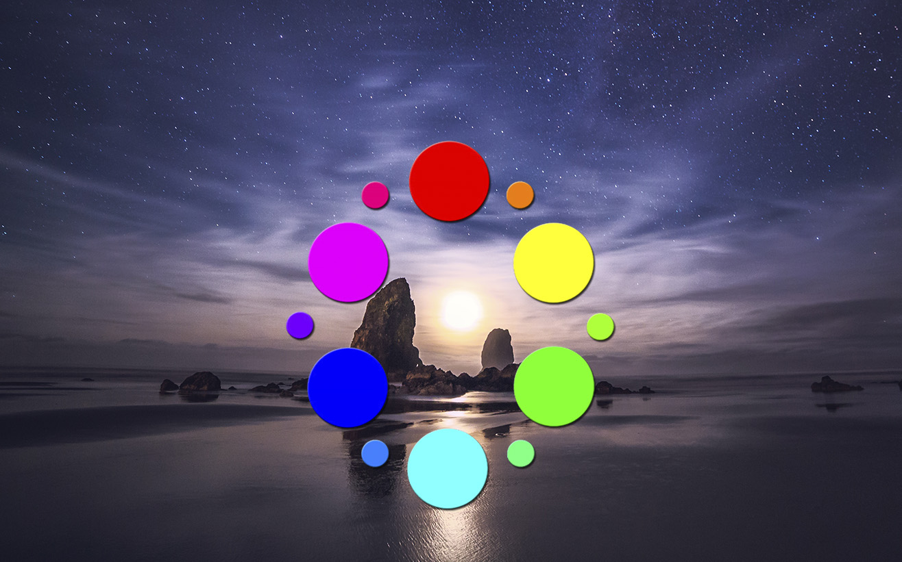
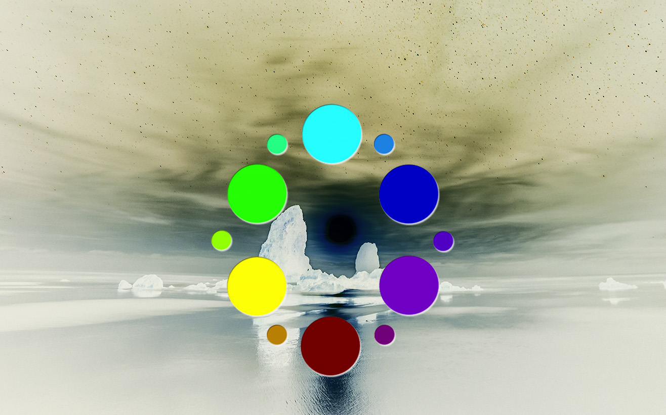
The Inverted Adjustment Layer flips the colors to their complement. That’s all it does when we see it on the Color Wheel, it is evident, but when we see it on our image, it just looks like a mess! However, that data can be used to our advantage!
In this tutorial, I am going to show you how to use the Inverted Adjustment layer set to the Color Blend Mode with an Opacity of 50% to assess whether or not our image is oversaturated! It is a pretty powerful technique to evaluate your colors, but don’t let that keep you from making artistic color decisions either!


Blake, I also like just plain old Apple Cider. Try this, go to a farm and buy a couple half gallon containers of UN-pasturized cider. Drink a glass from each bottle. Screw the caps on tightly and place them in the back of your garage refrigerator. Leave them alone for at least a month. You will have the most delightful, natural, sparkling hard-cider to enjoy.
— Dr. Bob
Really? That is VERY interesting. I am going to try that, we have a few local farms around here that may have some of that.
Very very helpful!
Glad you liked it!
Great tip as always Thank you Blake
Brilliant Blake! Adobe’s Upside-down World
haha, it certainly is!
I love the inverted image! You should add this video to the Inverted Image course on f.64 Elite.
Yeah, I am always coming up with new things… the downside of experimenting, haha
I don’t like Pumpkin Spice or Cider. Oh well. I guess I’m upside down. Great video. I will be using your “Action”. I love to add vibrancy and saturation to my photos. Now I can check and make sure I am not overdoing it.
Absolutely! But there is nothing better than hot apple cider on a crisp Fall day!
Great tip. I love COLOR. As a result, I sometimes don’t see when I’ve perhaps brought out too much color. This tip give me a way to analyze it and then make decisions from there. Thanks!
Whoa (faint sound of brain cells imploding)! This was fantastic, Blake! Hope you are doing well, my brother!!
You had me at the Intro and then you took me to the Upside Down! But guess what!! There aren’t any monsters there, only GOOD STUFF!! Great tutorial!
tru! but it can be ugly 🙂
I also love Stranger Things even tho I’m a bit older than you. I love this tutorial and am excited to try it thank you so much
Great tut but I think the lightbulb clicks “on” not “off”. My lightbulb is sporadically quite dim to off and tried the action but somehow I do not find how to save the corrected color image, just a new B/W one. ??? sure not doing something correctly.
I use your suite of inverse image actions on nearly every fine art piece I do, Blake. Welcome to the Upside Down.
Great observation and information to share. If you look at just below the birthday girls balloons you see darker aqua presented by I believe the shadow. When you desaturate the aqua color the dark aqua is still there but I believe it calls more attention to this for lack of a better word defect. I find this in my overall skies many times. I know there are complicated/involved processes to get rid of this defect, are there any simple processes to avoid or prevent this? {oversaturated/desaturated blue sky with blotches of dark/light blue}
Thank you Blake and Upside Down Universe. Just used it on an image I was processing. Made the image much better. I will have to check out Stranger Things. I love stories with alternate universes.
Knowing an image is over-saturated can bee important when printing. You can get away with over-saturation on a digital display but not with a print.
Blake, thanks for unwittingly coming to my rescue, once again. I am currently working on a Death Valley sunset photo and was wondering how to deal with the problem of oversaturation. Your tip and action will help me fix it. Most appreciated!
Definitely Apple Cider!! You should try Apple Cider donuts…YUM!!
Really liked this and look forward to putting it into action.
Again this is a great tutorial and with splendid and useful tip! Thanks Blake!!
Blake, thanks a lot for this super-tip to check oversaturation, easy to apply and use.
But I have a question. Can you explain how to come to a black and white image when you bring the opacity to 50% on the ‘inverted + color modus’ layer ?
Thanks in advance.
Sure thing! At 50% the complementary colors blend and cancel each other out leaving a 50% grey, the left over color is what is seen as over saturated.
Blake, thanks for the explanation, short but good.