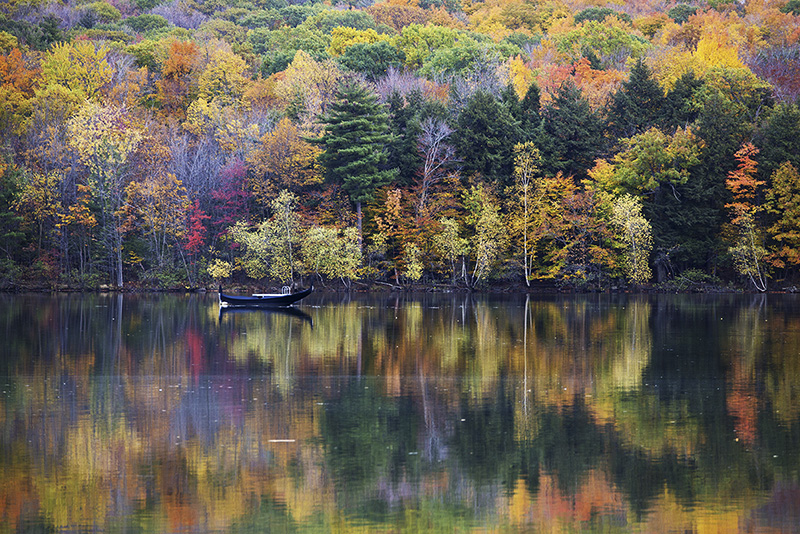
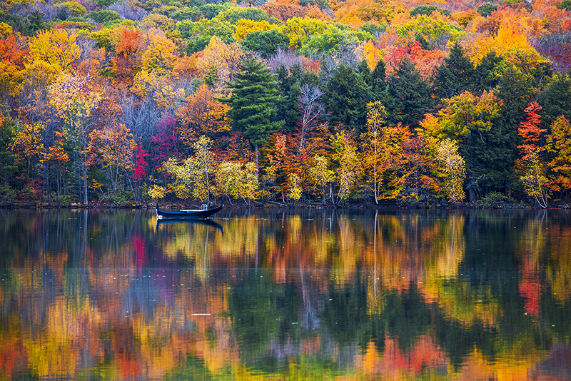
Ever wonder how can you make the colors in your Fall Photography stand out? Great locations help, but knowing what to do with those colors in post is imperative.
Today I am going to show you how I explore color in my fall photography. We will start in Adobe Camera Raw to build a healthy foundation of color, then take those photos into Photoshop to show how you can separate and simplify them.
The key to great color in your fall photography starts with a solid foundation. You can build that in Adobe Camera Raw or Lightroom. Most people head straight to the color mixer first, BUT I would recommend you look at the Calibration section first, then explore the color mixer. The Calibration section will allow you to exploit the color naturally, and then you can refine them further.
While I did mention you can use the Color Mixer in ACR or LR, I prefer to refine my colors in Photoshop. The HSL adjustment layer in Photoshop is very similar to the Color Mixer, but you have a lot more at your disposal with things like masking, blend-if, opacity, and blend modes. Lets also not forget the HSL adjustment allows for a 180 rotation around the color wheel for each color while ACR/LR restricts you to 30 degrees.
Furthermore, Photoshop has the infamous Selective Color adjustment Layer that is incredible for mixing the colors in your image like a painter. This is my favorite way of controlling color in Photoshop.
Below you will find two videos to help you get better color in your fall photography this season. start with the ACR video and then venture into the Photoshop tutorial.
Enjoy!


Every time I watch your tutorial, without fail, I learn something new! Great tutorials.
Blake, I really like your short videos. I can hardly keep up with your videos. I learn from everyone.
Thanks
Thanks! Glad I could help 🙂 I’ve got more coming 🙂
Do you recommend using a polarizing filter when shooting Fall colors?
Thanks for another informative tutorial.
I would. It helps cut the reflections on the leaves making them more colorful.
Thank-you for these short tutorials! They are packed with excellent content! How can I have access to these short videos later on in the future? Thanks!
MY pleasure.Since these are only available on YouTube, you’d have to bookmark them. I don’t make them available for download.
Wonderful tutorial – I’m heading into the mountains on Wednesday just for this purpose.
I noticed that on the Selective Color menu it has 2 choices; Relative and Absolute, can you give a short explanation what the difference is. I noticed that my page is set on Relative and yours was set on Absolute.
Thanks,
JB
I would stick to Relative. It doesn’t make a huge difference in most cases, but Relative sticks to the relative colors in the image. It gives a more natural appearance. However, you won’t see a huge shift between the two in most cases.