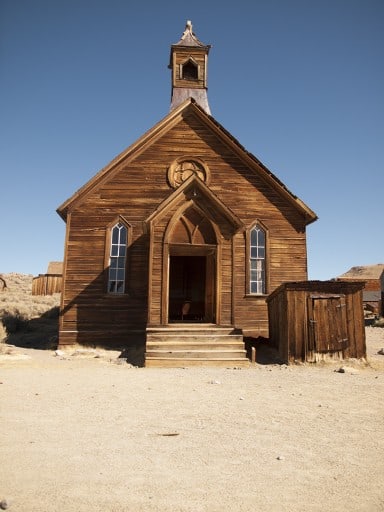
This month I requested that the members of HDR Insider make the image below look better. I was mainly referring to how horrible the sky looked, the image itself holds much to be desired as well! All of the members did a beautiful job making brilliant images from this blank canvas, but only one could win!

Usually it is pretty apparent which one wins to me even as the month progresses. This month It took me nearly 2 hours to decide. I went through all of them and looked at every aspect, they all had so much to offer and in so many different areas. In order to pick I had to give myself some criteria:
- How well was the sky removed?
- How seamlessly did the new sky render?
- How well were the added elements implemented (if any)?
- How true to life did the overall Composite look upon completion?
After answering all of those questions for the Runner’s Up, I made my decision. ChesnutPhotography blended the elements so well I thought the grass was a part of the image. Not only that but the sky, background and overall composite was seamless. From the color temperature to the overall contrast, it all just went so well together. ChesnutPhotography is this Month’s Winner of Topaz Detail!
Here is my entry. I have never liked following directions. That is why I like photography so much. I can do things my way. I changed more than the sky in my entry. I processed the images through PhotoMatix Detail Enhancer. Then Adobe Camera Raw, cropped, correct distortion, Topaz Remask (3 times I think) to get the foreground and middle ground from a photo from Arches National Park I have been working on, and another photo for the sky. I used numerous Hue/Saturation adjustment layers to get specific areas looking the way I wanted them to look. Then put the image through the Digital Zone System and worked on specific areas. I then used Viveza on the church and a High Pass Sharpen on the church also. I processed the image through Silver Efex Pro to get what I thought was a good Black and White photo and brought back some of the color. I know I did more than just the sky but I wanted to show what I came up with.
Runners-Up
Daniel Johnson
Runner-Up #1: Awesome inclusion of the sky and color temperature.
Johnny Santiago
#2 The for sale sign cracked me up! HDR Insider Discount! Ha! Great composite as well.

Cruizer1
#3 Great composite with an awesome tree element. I thought it was a part of the original image. I had to go back and look at it several times!
Christopher Cowan
#4 I really enjoy the dark feel of this and how you took a broad daylight image and incorporated it into a night scene. Well done!
Want to get in on the project Action?
Every month I supply a project for the members of HDR Insider to process. The winner receives a pretty sweet giveaway, like a $50 Amazon Gift Card, Software, or Training Packages!
There are several other reasons to join HDR Insider, have a peek for yourself!


