Learning the Art of the Subtle Hand
How much editing is too much editing?
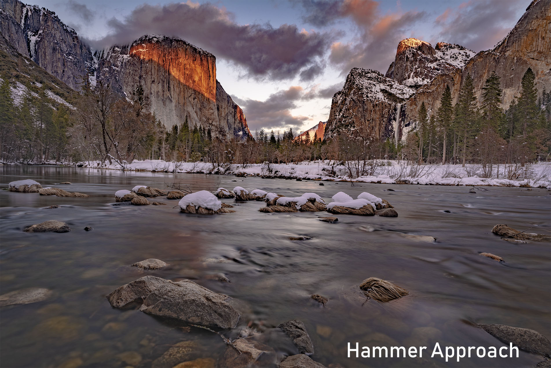
Over the last several years I have critiqued over 3000 photos between f64 Elite, my old site HDR insider, and the various conferences I have attended. One thing I see more often than not is the “Hammer Approach” to image editing. This approach is fast. However, it usually does more harm than good.
I am routinely asked, “How do I get rid of this halo?” or “When do I know when enough editing is enough editing?”
While these may seem like easy questions for a pro to answer from the perspective of a budding photographer, they are actually challenging. I have been thinking about how to discuss this concept for a long time and think I have finally found a way to visualize it.
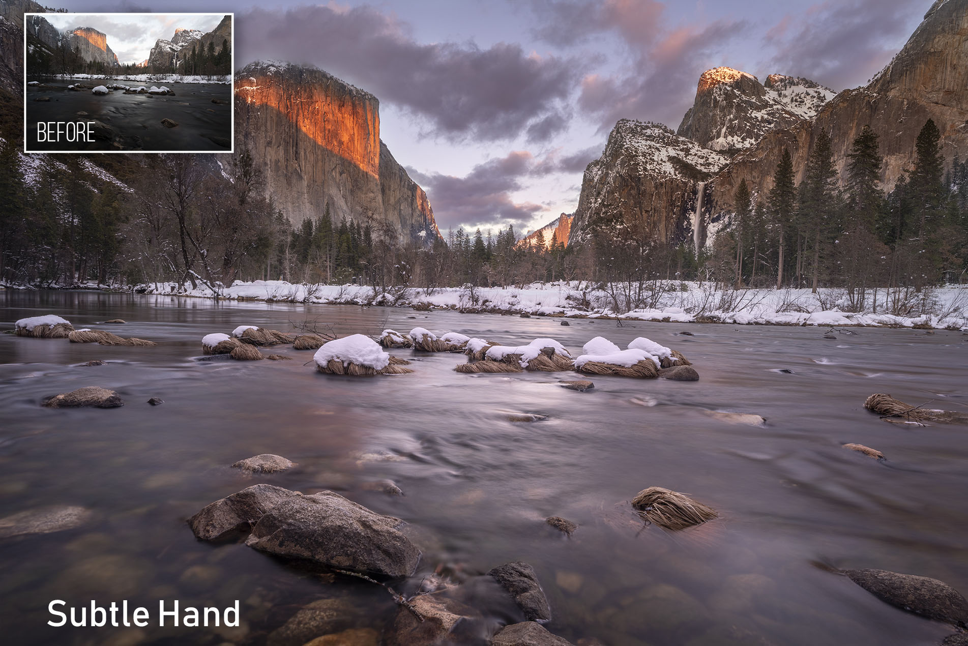
It has to do with learning “The Art of the Subtle Hand.” When you practice this form or photo editing you understand that the global hammer approach is far less effective than deliberate local adjustments.
In today’s lesson, I am going to show you what an image looks like that has been taken too far. We will analyze what we like about it and then we will discuss ways we can get achieve them without being so heavy-handed.
Free Live Event
Want to see me edit some more photos from Yosemite next week?
If so, join us on Wednesday, April, 17th at 2 PM Central!


Sometimes I feel like you are reading my thoughts from afar. I have been thinking about this topic a lot in the past week.
Great tute as always! Magenta masks for the win! I think I saw them the first time in a video you did about blend if. I have used that color ever since.
This also reminded me I need to re-watch the ACR tutorials on F.64 Elite.
I don’t take advantage of all of ACR’s super powers.
Cheers!
Watched your heavy hand. Done very well. Just could not figure out if you were using Lightroom or other editor program. Just did not look like Lightroom.
It was all in Adobe Canera Raw, same editing engine as Lightroom
Nice presentation, as usual. However, don’t you think that some photographers may prefer more vidi colors other than muted colors?
Absolutely! In that case, you’d want to go into the colors individually at their local level and manipulate them. That makes more control over color and a much more refined finished piece.
Thank you! I really enjoyed this great information.
Blake, great tutorial. I noticed your colour space is Adobe RGB – does this work as effectively if you are using sRGB? I get confused when some photographers say not to use Adobe RGB as most monitors cannot see the depth of it and sRGB is more universal. If I shoot in Adobe RGB, I always convert to sRGB before saving – is this a correct method? Thanks.
Great tutorial Blake. The old adage that “a little goes a long way” is so present in this edit and is certainly something I need to be present to during my edits.
I really like the feature of being able to change the color of the mask representation. As a dyed in the wool LR user this could well cause me to give CR a closer look.
Thanks for your great work.
interesting . . . .
Was there more to your comment, the elipses have me wondering ?
Great tutorial that identifies very appropriate edits that do not take a ton of time to implement. I totally agree with the subtle approach as it looks so much more natural when the editing is done.
My one question relates to the river in the foreground – as a secondary element in the picture that should support the mountains and the sky, it seems to me that you have lightened it up so that it attracts the eye a little more than the subject of the photo and therefore it seems to me just a bit less luminance would be appropriate.
I learn from you with every video I watch and thank you for that!
I liked the water so I brought the attention to it. The background, to me, will always be overpowering here so I wanted to draw the eye toward something else to then lead them around. It’s all really personal preference as you do make very valid points. Just depends on the day and the artist ?
wonderful vid as always Blake!
Thanks for another great tutorial!
I agree with the subtle approach. However, I wonder if the there is merit in stepping away from the edit for 30 minutes or so and then to evaluate what has been done. Sometimes when I return after a while I find that certain modifications are not exactly what they should be. Do you also have that experience sometimes?
As always your tutorials are timely, accurate, and easy to understand. Thank you!