When I first started shooting HDR images I was astounded by how awesome the details looked. I recall telling my wife that the HDR process made everything look good, even horribly compose pictures. I took a whole series of horrible HDR images with no concept of composition simply because I thought the process made them looked good. It is very easy to get tangled up in the habit of taking an HDR image for the sake of the process, but lets not forget the basics! Many of you already know them but give this tutorial a quick look over, you may find a new perspective on how your compositions effect the viewer psychologically.
Basic Composition
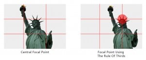
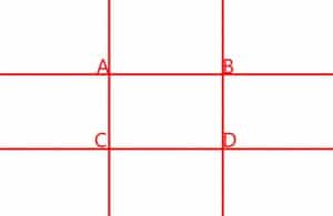 Every once in a while I hear this, “How do you take good pictures?” The answer I give is, the Rule of Thirds. I am a firm believer in the power of the Rule of Thirds. In most cases, 60% of a great picture is composition (the rule of thirds), 30% Luck (the right place at the right time), and only 10% technique (actually knowing your camera)! The Rule of Thirds is pretty simple, look through your viewfinder and imagine your image divided into thirds, vertically and horizontally. Now place your focal point within one of the intersections, labelled A,B,C, & D. If your focal point happens to be a landscape, place the horizon on one of the horizontal lines. If it is a skyscraper, try placing one of the sides along the vertical lines.
How does this simple rule make my images more powerful? The human brain processes images extremely fast. If the focal point is in the dead center the brain registers the whole image within a fraction of a second. With the focal point offset to one of the intersections you are placing a minor road block in the brains mapping system. The eyes have to work their way around the image in order to spot the focal point. The whole process is rather quick but yields about 2 to 3 seconds of attention. As photographers, we put our images out for people to see, why not try and get as much attention as possible.
Using the Rule of Thirds helps make “negative” space, like the white in the images above, become positive. The dead white space of the image on the left does not help the flow of your gaze. However, the “negative” space around the focal point on the right creates a positive space around the focal point. This gives your eye plenty of area to navigate the scene without going to the direct center and moving on. In a gallery the image on the right would hold about 3 more seconds of attention than the image on the left.
Mise En Scene
Pardon me Blake, what was that? MEEZ-ON-SEN, duh, it is French for “the placement of objects on the stage”. Think of the area you are about to shoot as a stage. Where you place your focal point(s) will have an incredible impact on the viewer psychologically. Now that you know how to properly compose the focal point using the rule of thirds, it is time to think about how the placement of the focal point will effect the thoughts and mood of the viewer. You, as the photographer-composer, have the capability to control your viewers emotions with your images, whether they realize it or not. After a couple of examples you will see what I mean.
A Sense of Time
Most cultures read from left to right. Using the left to right concept in photography you can portray reflection and foreshadowing in your photos. The image on the left portrays the model looking to the left making her appear as if she is reflecting on the past. With the same model looking toward the right, the image foreshadows an exciting future.
Setting The Mood
The direction of the primary lines in your images play a strong role in the mood for your viewer.
Horizontal lines create calm, peaceful, tranquil moods.
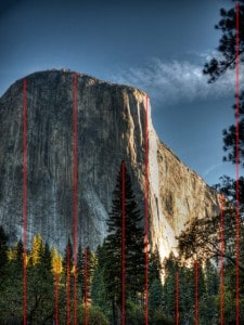
Vertical lines lines portray power, strength, stability, like the granite monoliths of the Yosemite Valley
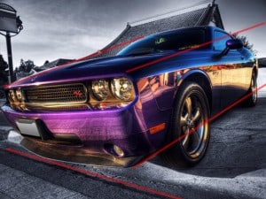
Diagonal lines pull the viewer in, grabbing them by the eye often conveying energy, vitality and sometimes aggression, especially in automobile photography.
Sure there is plenty more to learn, but play with these ideas first. You have to start somewhere, and if you are already advanced past this, sometimes it is good to see composition through another’s eyes.

