
For years, I wished I could reach for tint and temperature inside Photoshop the same way I do in Adobe Camera Raw and Lightroom. Now we finally have it. The new Color and Vibrance adjustment brings those sliders right into the layers stack.
At first glance, it looks basic. Temperature, tint, vibrance, saturation. That’s it. You might think, “No big deal. I already have that in ACR and Lightroom.”
I still use ACR or Lightroom to set the global white balance for the whole image. I want the base file to feel neutral or as close to the color of the scene as possible before moving into Photoshop. Once that’s in place, this new tool becomes something else. For me it has turned into a local color grading engine.
Because it’s an adjustment layer, I can mask it. I can paint warm light into one part of the frame and cool shadows into another. I can use it like the old American landscape painters did: warm colors to pull things toward the viewer, cool colors to push them back. Foreground elk, warm. Background trees and hills, cool. Depth through color, not just blur or tonal effects.
Under the hood, it reminds me of a trick I’ve used for years: a solid color fill set to a strong blend mode, like Vivid Light, with the fill lowered. In the past, I had to choose the color, change the blend mode, and dial the fill for every single look. Now, with this new tool, it feels like that whole process is baked into two simple sliders. Pick warm, pick cool, fine-tune tint, and move on.
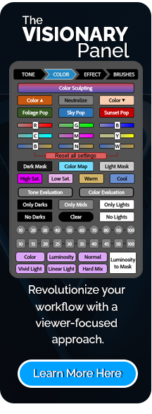
Inside f.64 Elite, I’ve been using this in critique sessions all month. It has opened many of “aha” moments for people who struggle with warm/cool balance and depth in their images. If color grading has felt hard or random to you, this might be the tool that finally makes it click.
***The Black Friday 5-Day Free Trial to f.64 Elite has ended, but you can click here to become a member today!

For Blake, it's all about the art and process synergy. He dives deep into complex topics and makes them easy to understand through his outside-the-box thinking so that you can use these tricks in your workflow today!


AH HA! I was just trying to pull out some gold on a cliff face for my new Canon310, and it wasn’t working – then boom. I saw this video and used the new adjustment layer to do the job. Thanks Blake!
Woo hoo! I love it 🙂
We purchased zonefx and the visionary panel 2 because of your scientific approach to art. It is appreciated thank you.
Thank you! I definitely appreciate your support of my work.
I’ve been using it since the update for lots of subtle grading similar to what you mentioned. It stood out to me as soon as I saw it and realized I can pull the natural color balanced raw file into PS and make it pop in a number of ways: foreground vs background, subject vs environment, spotlight vs vignette, foliage vs sky, buildings vs reflections, etc.,.etc.,. etc,.. It’s wonderful.
Hi Blake. Thanks for the short on this tool. I am a new member to f64 and have loved it. My camera club buddies asked me “What happened?” I tell them about the Vision Panel and how much more I feel I am in the creative seat. what I mean is that I learn how to use tools in photoshop to get to my vision. I don’t use an automatic plug in that doea the creative part. You have encouraged me to experiment more.
Thank you
Firstly, thank you for your summary of this new layer – So good to have this possibility within Ps. I think we are going to be using it a lot, both with masks and without. Secondly, thank you for your appeal to Adobe; less AI and please, bring those antiquated Color Mixer, Selective Color and Color Balance layers up to date. And finally, I am still in awe of your Curves presentation at the Photoshop Virtual Summit. (And I thought I knew about Curves…)