Using Selective Color to get better tones in Photoshop
You know my workflow, Tone, Color, Artistic Effects, right? I preach it all the time and more often than not, I teach how to get better colors through your tonal work first, right? Well, recently, I discovered an incredible use for the Selective Color Adjustment Layer to get better tones.
Wait, hold the phone…
So Blake, now you are telling us we can get better colors through our tones and better tones through our colors? Uh, yeah, that’s precisely what I am saying. Now to blow your mind one more time, you can use color to get better tones, so you can use tone to get better color so that you can get better color from your tonal colorwork…
Not only is that a tongue twister, but it is confusing as all get out! I promise this tutorial will be more straightforward than reading the last sentence of that last paragraph.
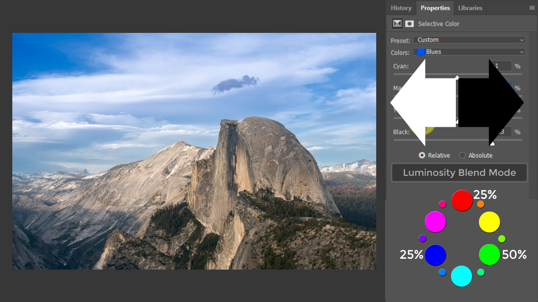
What I discovered recently is that you can use the Selective Color Adjustment Layer with a Luminosity Blend Mode to get a ton of control over the tones in your photo. The Luminosity Blend Mode only allows the selected layer to affect the underlying layers Luminance values. So when we use a Selective Color Adjustment Layer set to Luminosity, we get to control the tones in our colors without shifting the hue or saturation of the color.

Trust me, all of this will make more sense when I demonstrate it. These are some advanced concepts that I think you will find quite challenging to wrap your head around from one viewing.
Therefore, I STRESS that you experiment with it. It’s simple:
- Make a Selective Color Adjustment Layer
- Select the LUMINOSITY Blend Mode
- Select a prominent color in your photo.
- Move the sliders to the right to get darker
- Move the sliders left to get brighter
- Repeat as necessary for each prominent color in your photo
That’s it, pretty easy, huh? Let’start with the tutorial first; then, I give you permission to run off and experiment.


Thanks Blake for another excellent tutorial. Can’t wait to put into practice!
Sweet! Thanks for stopping by.
Very helpful, thanks!
A very useful video which really helps with both tone and color.
Crazy, huh? Never thought I’d use that for tones too.
Spent 2 minutes playing around with selective colour on one of my images. Amazing the control you have on the tones and colours.
Going to be using this method a lot!
Thank you!
My pleasure, glad you saw the same light I did 🙂
Excellent & Elegant.
Thanks!
Thanks! Nice discovery.
It was a happenstance happy accident!
Fabulous stuff as usual Blake. thanks.
Blake, this proves that the coffee money I sent you was well worth it! Thank you, again!
I captured over 7000 photos last June on our three week vacation of Norway and the Baltic. With this method I can get the tones and colors done very quickly and spend a lot more time on the effects. What a time saver…..
ggiannini40@gmail.com
That’s awesome, Blake. Taking a short break now, but after about 3 more hours of shoveling fresh snow 🙁 I’ll be giving this a try 🙂 . Thanks for the “mind bending” tutorial!
Hey, Blake! You really got me thinking on this one. How would you compare what you’re doing here with using a B&W adjustment layer set to luminosity mode instead? And then using Selective Color on top of that?
TVM Blake!!! Again a splendid tip!!!
Blake, at 9min 54 secs you add the 2nd selective colour layer you say it’s set to tone AND colour but I don’t see such a setting on the panel, can you clarify please
Hi John!
That is what he said. However, I believe Blake means the first SC is for Tones and the second SC is for Colors (no luminosity setting). Two layers: one for tones and one for colors.
Good discussion, Blake!
You realize of course that this is exactly the process you advocate for B&W conversions & extended to colors.
Typically, you place B/W gradient map above a color image to create a mono image. Then place just about any color adjustment layer between the Grad Map and the color image. The manips in the color adj layer get translated thru the Grad Map to BW tones. (Luminosity)
Here you have extended it to color editing in non-mono images.
Well done!
I watch all your videos and although this one sounded confusing. I thought you explained it very well and it is a process I plan on utilizing.
I was confused at 9:56. You brought the layer up “SC for Tones” in the luminosity mode. You next brought up “Selective Color 1/SC1” layer in the normal mode. When you brought the video to full screen the window says luminosity mode. Did I miss something?
THIS is a Christmas present !!
Wow, sort of a mind…. Do I sense something to be added for ZZE7?
Great stuff Blake.
Wow, sort of a mind…. Do I sense something to be added for ZSE7?
Great stuff Blake.
Thanks for discovering this and passing it on.
You are something of a genius! Total control.
WOW!
hi Blake,
wonderful stuff as usual. just wondering how these techniques might relate to working in the Lab color mode with a curves adjustment layer, whereby the L channel is independent of the a/b color channels (not considering the adjusting layer blend mode).
Thx for another great video.
Absolutely mid blowing! Thanks, Blake!
The professor is in the house! Great stuff, my brother!!
I have to say that this is most interesting, I have never thought of using the colour balance layer this way. I always wondered what the “relative” button was meant for
Now, I have an idea. Excellent video as usual. Combined with the blend mode, it is powerful
Tried this technique with the color balance adjustment layer. The sliders are a lot more sensitive-have to use very small changes in the sliders. I like the selective color technique better. Just thought I would try it to see what it would do.
Kaboom – that’s my brain exploding! Would you use ZSE first then add this as a further refinement?
Nurdie, dorkie, whatever you call it, it works. Thanks Blake another excellent tutorial.
Awesome technique, Blake. Not geeky at all LOL
O Honorable Guru! One word about this tutorial:
WOW!!!!!!!!!!!
Great insight into color. Created a quick macro to set up the layers and it’s a cinch to use . . . thanks for an excellent addition to the skills set.
Please keep telling us about these dorkie things, the power of leaning greater than money, thank you Blake
Thank you for the tutorial Blake…this is why I never miss the mails that I receive from you… : ) Happy times to you and your family!!
Great tutorial, Thanks for doing the nerdy dorky stuff for us. Happy Holidays to you.
Loved this video, you have a special skill to make such complex things perfectly accessible. I’ve watched it twice, tried out the technique and am rapt with the results. Thank you.
All I can say is revolutionary, huge improvement in the colour work I am doing
I have used SC for a while now, I never thought to use it for tone though. Thank you, I am stoked and look forward to working with it.
Amazing… you’re right… I don’t get the technical stuff, but the result is amazing. This is the best color and tone adjustment strategy. Thanks for an awesome insight.