Two Alternatives to Selective Color
The Selective Color technique is something we all try at some point in our photography endeavors. The classic act of taking a color image, making it Black and White, but letting a single accent color of the subject matter show through has become a faux pas in the photo industry. The technique is used to focus the viewer’s attention on one area over the rest, but it is entirely too literal.

What a way to ruin a great monochromatic image. Not one, but two selective colors! We know the hat is red, we don’t need to see that.
If you have to narrow the viewer’s attention to your subject with the selective color technique, two things could have gone wrong. Either your subject wasn’t very interesting, to begin with, or you may not have composed the image well enough for the subject to be received. Either way, selective color in its typical fashion is the last resort because it could ruin a great monochromatic image like the one of Michael (my oldest son) from 2011.
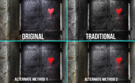
Instead of the extremely literal selective color technique, I have two alternatives for you today. They are more about selective saturation than selective color. By using these techniques, you can create a sense of depth in the photo with color manipulation rather than throwing out all of that valuable color. There are two methods that we will discuss in this tutorial.
- Using the traditional selective color technique but with a much-lowered Opacity. This method will yield washed out colors, but not make the image monochromatic.
- Using the HSL Adjustment Layer to selective increase or decrease the saturation of colors you choose.
Utilizing these techniques, you can create color planes in your image. They are similar to focal planes in that the use of selective saturation will make the fully saturated area stand out more. This technique can create a sense of depth in the image by separating the saturation levels of colors.


Another great tutorial, Blake! Love the subtlety as opposed to the in-your-face color selection!
Thanks! It is subtle, but effective. I use these techniques a lot to control the color in my images.
Blake, I feel like I just visited my psychiatrist and had a break through…I like selective color images. In some unknown way, that may be contributing to my post processing skill deficit. Probably need more counseling. Loved the video! Thanks…Bruce
Bahaha! I know the feeling. I used to adore the technique. Then I got sick of it and realized I wasn’t doing my images much good, like the early portrait of my eldest son.
Very helpful for us amateurs. Thanks
We are all amateurs in our own right! That’s the beauty of always learning.
Hey, Blake! Love the concept – stop making rookie mistakes. I’d love to see more videos along this theme. Also noticed that the image of you and your office seems to emphasize your point – everything (including you) is desaturated by about 50-70% while your t-shirt stands out as a slightly muted red. Nice touch!
Haha, I wish I could say I planned that, however, that is the crappy recording quality of the software I use. I am working on that. Although, it does make the content more important when you aren’t focused on me… I’ll go with that 🙂
Thanks a lot, Blake, it was very useful for me. Two years ago I published my “super” photo pure B&W with something red in the middle. And was bad surprise that received a few points only…. Now I know why…;)
But I have another question. When I saw the title of this tut I expect to see and learn something about Selective Color Adjustment L.
Would you prepare some tut on this topic sometimes in the future?
Thanks
V.
Great tutorial Blake – I’ve always used curves to accomplish this, something new I can add to my arsenal of PS skills
Thanks
That’s why I love PS! There are a million ways to get the same objective accomplished. Glad I could give you some new insight.
I love your tutorials, they are among my most favorites!
Awesome! Thanks, so much, Michael!
Another great tutorial Blake and something else to bear in mind on some shots where i have people wearing anoraks in landscapes. Very well explained, as always.
Oh yes! That is the perfect use for this. Tourists can make or break a shot really. I was in Oregon shooting Multnomah falls and there was a guy on the bridge with a bright neon yellow shirt. It ruined everything!
Great video, Blake! I used to love this technique! Your info sure makes sense, though. Thanks for your sense of humor, helps me to remember the tutorial! Dee
Yeah, it had its day for everyone for sure. I get the intent, but there are better ways to get that point across.
Thank you once again for teaching us a wonderful technique. Came at a perfect time for a project I am involved with.
No problem, Pam! Just glad I could help.
Nice video tutorial
Thanks!
Once again you got me thinking … I’ve only used selective color to the extreme once. After viewing this I decided to give it another whirl on my only photo. I didn’t use photo shop at all – everything done in On1 Photo RAW. I like both versions, but I think your method selectively decreasing saturation made it a better image.
Thank You!
Yep, ON1 can do this too. So many possibilities. Glad I could give you something new to play with.
Can always find use for this technique…thanks.
Sweet! No problem, it was my pleasure!
Very well presented.
Great skill to develop to improve skills and gain ,ore sophistication with photography.
And I like the news skills for me that you present.
I appreciate the feedback. I am so glad I can help. Thanks for watching!
Great video. I’ll give it a try. Always ready to learn a new method. Thanks.
Awesome! I love your ready posture for learning mentality! That is a healthy one.
The more I listen and watch your videos, the more I need. By far you are one of the most interesting instructors on the planet when it comes to teaching Lightroom or Photoshop. I absolutely love your enthusiasm for helping people learn new ways to approaching concepts. It’s direct and simple and very easy to understand. Thank you.
The most interesting, I like that 🙂 I get so worked up when I turn that mic on, I really can’t help it. Critique sessions REALLY fire me up 🙂
Thank you for the wonderful testimony to my teaching approach. It means a lot to me.
Great post Blake! Especially using the pushing & pulling of colors instead of B&W.
Another great learning sessions for my notes. Like this selective color, need to practice more with color range. I did a few already and I like the impact it makes on my images
Hi Blake: Great post and video. I have two questions and I will use your example image for my questions:
–If I want to change the color of the buoy or enhance its red color, what is the best way to do that. I tried several techniques (Hue/Sat, Layer Group with mask) and they didn’t seem to work.
–How would I remove other reds in the image, as the roofs in the background, but keep the red in the buoy?
Many thanks, Frank
Wow. This inspired me to rework one of my favorite photos with somehting I learned from this video. Your vidoes are always very helpful and inspiring. I do photos in the virtual world of Second Life and most I learned to improve I got from your tutorials. Thanks a lot Blake!
Hoi Blake
This is a great way of helping the amaters to upgrate there skills.
Thank you so mutch
Louis
Another great tutorial Blake. Now I can do something more creative with some of my images which I thought were useless.
I love the tutorial. I began to be aware of planes of saturation a few years ago and I think it, along with detail/sharpness planes are the two most under utilized mechanisms to improve the story telling ability in an image and they are so easy to perform in Photoshop.
Thanks, Jeff. I agree, very simple, yet so powerful and often overlooked.