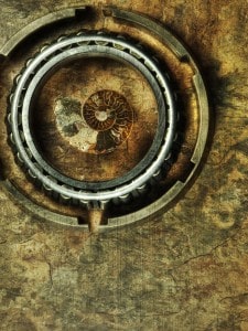
Ever seen an image like this? The faint streaks running down the side of the image make it appear as if it is an old vintage photo. This texture application is a great way to make your images appear tactile. These textures can be anything. As a matter of fact I often go on what I call “Texture Shoots”. During these shoots I photograph anything from grass and gravel to walls with pealing paint. I put them in a folder called textures and I save them for a rainy day image. An image that could use a little bit of help to push it to the next level. Nautilus, Chambered, to the left, was one of those images, it just needed an extra kick of invisible goodness. This a VERY simple technique but can be incredibly powerful when used correctly! Follow along and you will be texturing HDR style in no time!
On The Hunt For Texture!
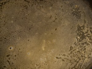
First thing is first, find yourself a couple of good textures. It is a good idea to have your camera with you at all times, even when you are cooking. The other night I was making sauteed onions and what better to soak the onion in than a bath of melted butter. I noticed that the butter was bubbling up very nicely and creating a pretty awesome texture. So I ran and grabbed the camera and snapped a quick picture of the bubbling butter. Is it a great picture? Not at all, but it will fit nicely in my catalog of textures! I do this all the time, for everything. You know that picture you took by accident of your foot while walking that is blurred beyond the point of recognition? Don’t throw it away, stock pile it, that can create a nice texture on a future image.
In case you were wondering, I do not shoot my textures in HDR. I noticed that HDR’ed textures tend to be too detailed and distract from the HDR image I am trying to enhance. That is my personal preference. By all means experiment!
The Application of Butter As A Texture On Your Images….
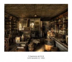
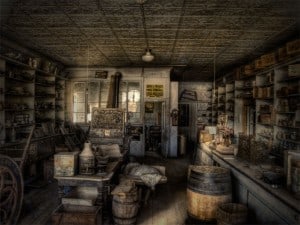
Above is the general store in Bodie, CA. I shot this one through a window with my focus on the inside of the general store. I wanted a gritty feel, but no matter how I processed it in Photomatix it just wasn’t the right feel. So I went into my texture stock and what did I find? Bubbling butter! Check out the application.
- Open your image into Photoshop.
- Make your typical adjustments, i.e curves, levels, saturation (for help with Adjustment Layers). I used my typical curves and levels adjustment.
- Now get your butter! Or whatever texture you want to work with and open it in Photoshop.
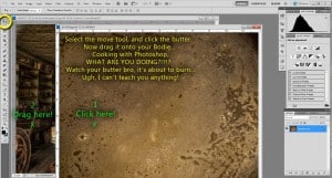
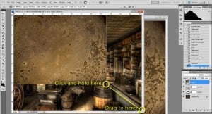
- There are many ways to import it as a layer over your desired image, I prefer the move tool. Move the butter onto Bodie.
- Now you should have two layers in your pallet (maybe more depending on the amount of adjustment layers you needed, in my case 4 layers).
- The texture is not the same size as the Bodie image, this is not a big deal, Ideally you want your images to be pretty close to the same size, however the texture application will be faint so detail loss will not be a deal breaker.
- Resize your texture to the size of the background image being effecting. Press Ctrl+T (On a Mac, well, just trash your Mac and get a PC so I don’t have to refer to it :)… Sorry, on a Mac it is Cmd+T). Drag the lower right corner of the texture to the lower right of the background image. Size it up so the texture image covers the entire background.
- Once the texture is resized, we are going to manipulate how it blends with all of the layers below it.
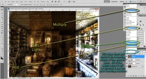
- In the layers palette click on the drop down box that says normal (make sure you have your texture layer selected).
- This box controls how your texture layer will blend with the layers below it. In the image below I have given examples of 4 different Blending Options.
- I could go into how all of them work, but I would be lying if I told you “I just know” which one will work. I play, I always play, I will cycle through everyone of them before I select the one I want. I suggest you do the same! The easiest way to cycle through them is to click the drop down arrow, they will all appear above. Then click the arrow again, they will all disappear. Now either scroll through with your mouse wheel or press the down cursor on your keyboard.
- I am a big fan of what is happening with divide, however, it is way too much for me. Divide is a new blending option in Photoshop CS5. It usually is not useful for me, but I like how it is effecting the image.
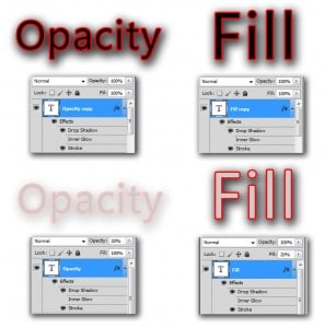
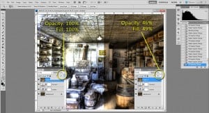
- Because divide is manipulating the layers below drastically I am going to tone down the opacity and fill of the effect. Opacity effects the overall amount of transparency of the layer. Fill effects the amount of color filling in the layer. Fill will not effect drop shadow or other blending effects. Notice the transparency of the entire layer changes when Opacity is adjusted. However, Fill only effects the color filling in the layer, the drop shadow and stroke is not effected.
- I am going to play with those 2 options to tone down the effect of the Divide layer option.
- I am pretty satisfied with the image so far, but like a good cake…. It needs icing!
- How about the vintage feel of a vignette?
- I know, I know… how kliche! But it looks good!
- Flatten the image by holding Ctrl+Shift+E (Cmd+Shift+E on the Inferior Box).
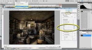
- Go to Filter>Lens Correction>Custom
- Pull the Darken slider to -100 and the Midpoint slider to +10
- Like a steak with A-1….Done!
If you have made it this far, you deserve a reward. How about my Butter Texture. Unzip the file and start making your images tasty!
Make sure you make a texture folder and start texture hunting.

