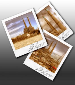
So last Friday I posted the tutorial on achieving the Polaroid look with color Balance, Saturation, and a gritty texture. I had almost completed my Polaroid border, but it wasn’t complete enough for me to share with the rest of you. After a couple of strategic moves (a gradient, really that was all it took to finish it…doht!), I have the finished product. You may be thinking, “Well that’s great and all Blake but what is in it for us?”. Fair enough question, I am just a generous enough guy that I would never require you to make the template, I give those kinds of things away to my viewers! So on Friday, I will have a package for you to play with and a tutorial on how to get it all in the works! For now, here is the final product, stay tuned for Friday’s tutorial and the Goody Bag!


