It’s Hip to Be Square
I just couldn’t pass up the chance to use the lyrics from an amazing ‘Huey Lewis and the News’ song to describe some awesome metal prints!
I recently had the luxury of working with Ben Gasser and Bryan Azorsky of Tin Man Prints. They run a local Kansas City business focused on metal printing, with a fascinating twist. Ben and Bryan are passionate about what they do and it shows in their product quality and inventive mounting system.
There are a lot of options for printing on metal these days, so what makes Tin Man different? There are 3 very distinct differences between Tin Man and the rest:
- They only print in the square format. While this may seem like a limitation at first, the square print format opens you up to a world of creative display possibilities.
- Their wall and tabletop mounting is revolutionary. I watched Bryan hang four 5×5 images on a brick wall in less than 30 seconds, and they were all evenly spaced to perfection.
- Their print quality is impeccable. I have printed with many metal printing companies and have yet to see a metal print look this good. When I met with Ben and Bryan I had to ask what they did to my prints to achieve the quality, they said smiling ‘nothing, we took your files and we printed them, we didn’t need to do anything’. The prints appeared as they did on my monitor (others may have different experiences), I could not have been more impressed.
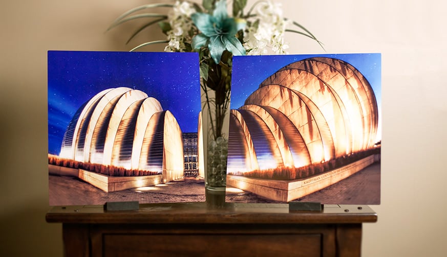
The Tin Man Experience
The Website
Your whole experience with Tin Man Prints will start on the website. The main page is clean, elegant and easy to navigate. Their message is clearly stated and there is a nice informational video that opens the site and shows you how their system works and just how versatile it can be.
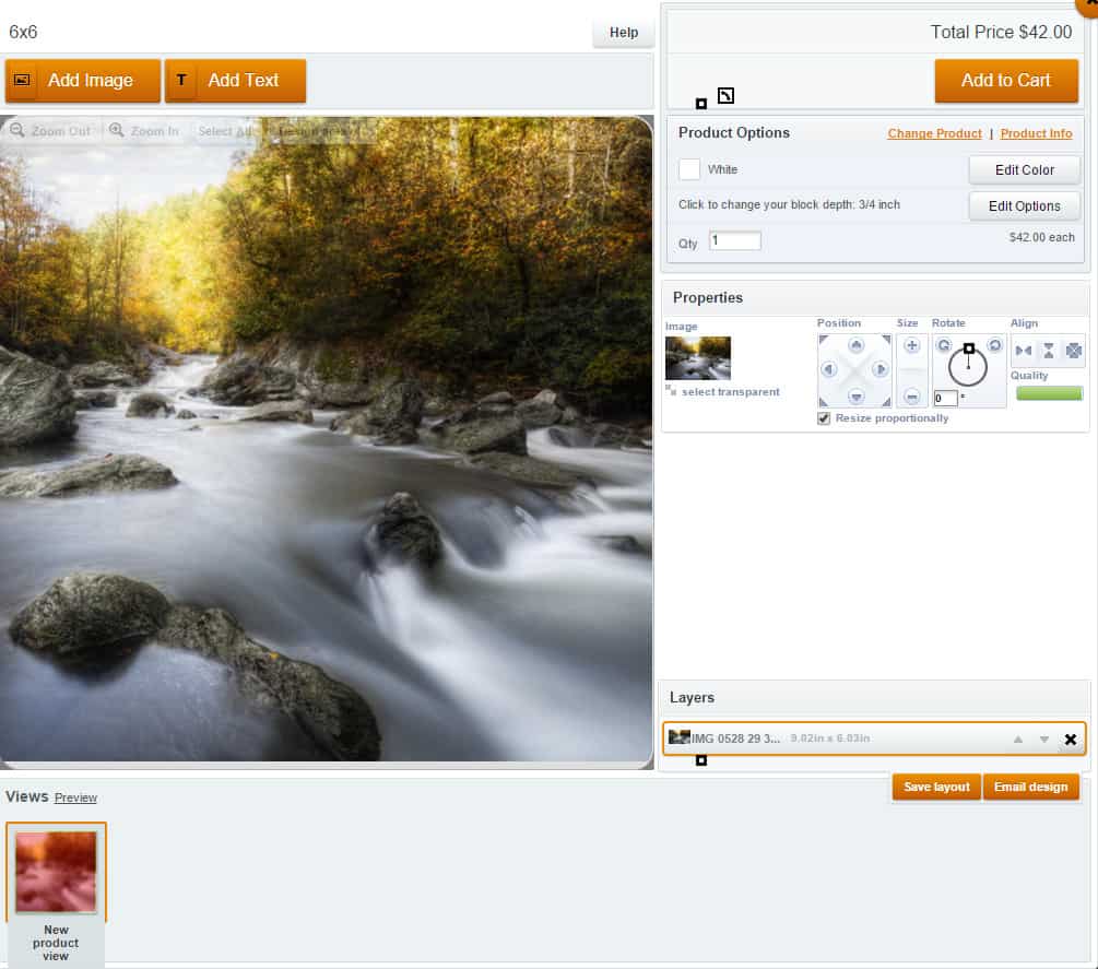
When you select ‘Click Here to Buy’, you will see the 6 size options available for printing. After selecting the size, you will be prompted to setup your image for print. Here you can adjust the crop, add text, and so on. I purposely uploaded a very small image to the Designer to see what would happen.
In the properties tab of the designer I was told, “This image has been resized to the point where it may appear blurred” and I could see the quality was in the red. I was pleased by the warning signs and given a warm fuzzy feeling that they wouldn’t print just anything without telling me there was a problem. I proceeded to checkout, regardless of the warnings, and yet another pop up appeared telling me the quality was not very good. Again, a nice touch to ensure great quality prints upon receipt.
The beauty of their design system is that you do not have to pre-crop your image to a square before making the print. The design system will allow you to pull in any size or shape and crop it accordingly with a large preview. With Tin Man, what you see in the design view is what they print and what you receive in the end.
The Print Quality
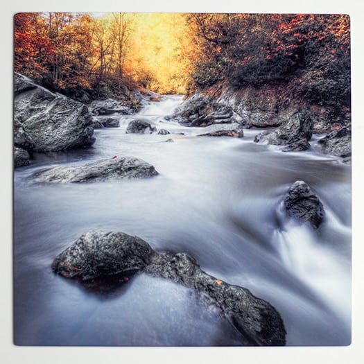
As I stated earlier in what sets Tin Man apart from the rest, their print quality is fantastic! I recently printed the same image with other companies so I had a great way to compare and contrast. While I was pleased with the print quality of the other companies, I was blown away by the craftsmanship in the Tin Man prints. The first places I looked when I opened the prints were the highlights and shadows. The quality of a print will speak for itself in the details held in the darkest darks and the lightest lights.
In this print in particular I used the Digital Zone System to lighten the darkest areas of Zone 0 to bring out the details in the darkest parts of the image then went into Zone 1 and made them a bit darker. This technique allows for the darkest areas of an image to render detail yet still appear as a shadow area. I do this specifically for print so that dark areas do not turn into globs of black, but areas of strong detail. For the first time, I was able to see just how effective this technique was in the Tin Man print.
Mounting the Prints
The wheels in my head started spinning the moment Ben and Bryan showed me their patent pending mounting system. In its simplicity, it is pure genius. You have two options for displaying your print. I will discuss the basic methods before I get into some more advanced thoughts.
Wall Mounting
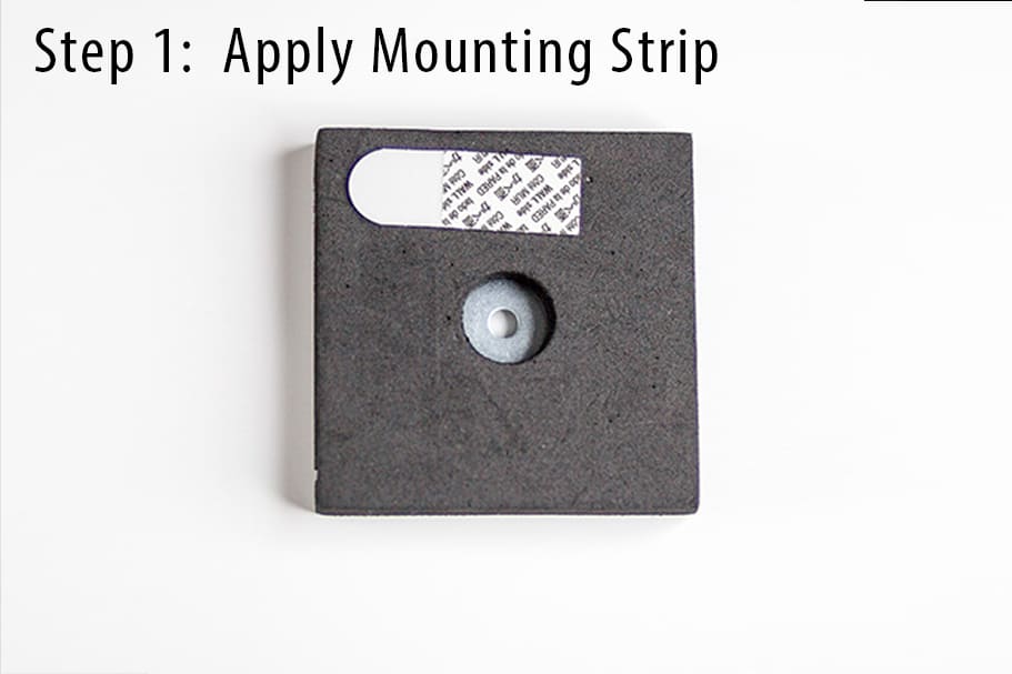
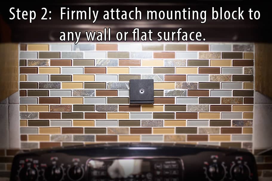
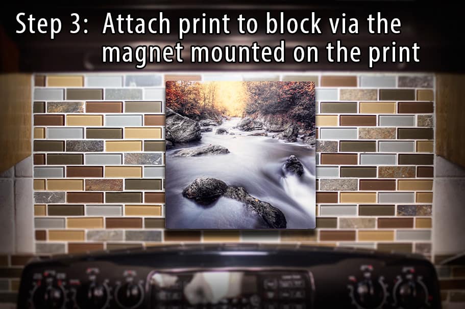
The basic concept of wall mounting, you have a print with a magnet attached to the back and you have a block with a 3M™ Command ™ strip on the back of it. You place the print on the block, remove the adhesive protection and place the print on the wall. No nails, no fuss, I like this a lot!
To really see how well you can take advantage of this system, I placed a print on the back splash in my kitchen in less than 5 seconds without marring the surface. See the series of images below.
In this series you are seeing one image mounted on the wall. However, the gentlemen at Tin Man have developed a system that allows you to hang multiple images in a series in seconds, no rulers, no laser levels, no tape measures. To do this you have the option to purchase an additional adjustable mounting aid (the mounting tools will come free with any purchase of 4 or more of the same size). Using a level app on your cell phone, you place the phone on the built in ledge, secure it in place and put your mounting blocks on the adjustable magnets. Once you have the proper spacing, you firmly press the blocks against the wall and place your prints on the mounting blocks, done. During a discussion with Bryan, I watched him demonstrate hanging four 5×5 images in under 30 seconds, did I mention it was a Brick Wall? With larger prints, the concept remains the same but the spacing changes.
Tabletop Display
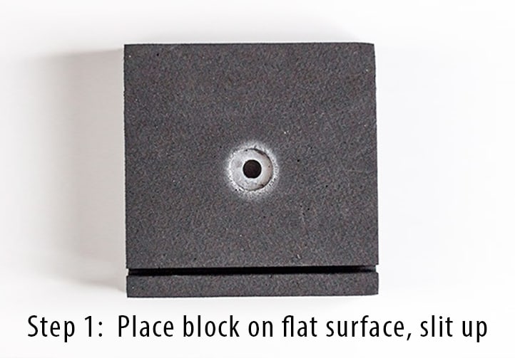
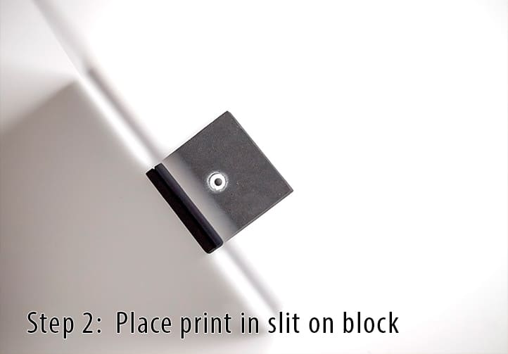
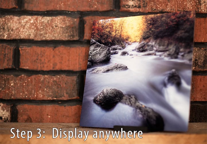
Aside from traditional wall mounting you can also display your images on any flat surface. To do this you simply use the slot in the mounting block. Place the mounting block with the slot up, place the print in the slot and you are free to display your print anywhere. Using this method you can display any of their print sizes, including their 15″ x 15″ prints.
Creative Display
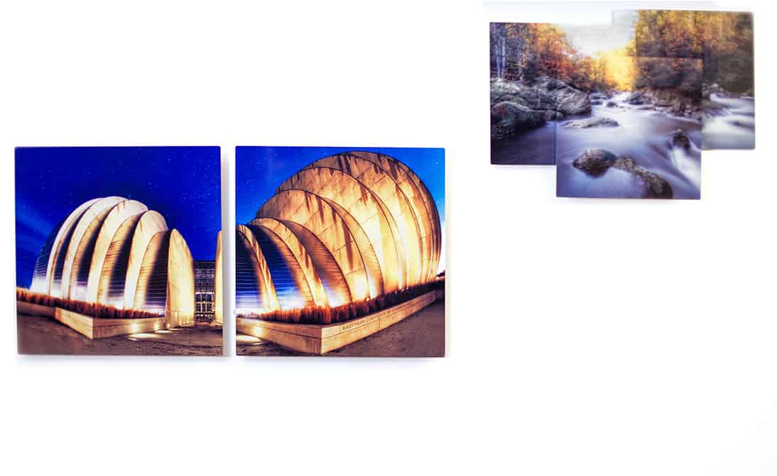
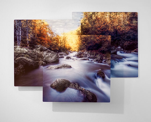
Immediately after discussing the square prints with Ben and Bryan, I started thinking. I will be honest, my first initial thought was, ‘How the heck am I going to print a square?’. I really beat myself up on this one for a bit because I assumed I had to have the perfect image for a square, that only certain images would look good as a square. Then I thought about it a bit more. ‘What would happen if I broke an image into 3 squares and hung them on the wall in a creative way?”
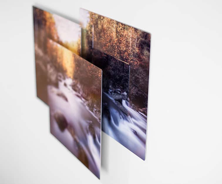
I began plugging away at this concept, taking full advantage of their multiple sized mounting blocks. I figured if I made three square prints that had a decent amount of overlay I could successfully separate forground, middle ground, and back ground. I normally do this with dodging and burning in the photo, but now I can do it with the display of the images on the wall.
- One image was attached directly to the wall (the background)
- Another was attached to the wall with one 3/4″ block (the middle ground)
- The final image was attached to the middle ground image with a 1/2″ block (the for ground).
When I saw the three separate prints my initial thought was thwarted. Each of the three pieces looked like 3 great separate prints. The truth is, the square crop is relatively easy to manage. Each one of these three prints could very easily be separated and look good on their own displayed in different areas in the house or office.
The Bottom Line
***The photographs of the prints in this post do not do them justice!***
I would highly recommend printing with Tin Man prints. Ben has years of printing experience as a Fine Art printer and has a wealth of knowledge in print techniques, tone and color. Beyond Ben’s knowledge, their prices are fair and their print quality is in the top tier. While I am infatuated with their print quality I am also blown away by the mounting method. Not only is it clever, it is effective and efficient. I hung five prints in less than 3 minutes, no nails, no mess, and when I take them down there will not be any holes in the wall to patch and paint later! The best part, I am now seeing some very creative ways to print and display my HDR photographs.




THANKS FOR THE HEADS UP ON THIS COMPANY AS I MY MOST FAVORITE PRINTING MATERIAL IS METAL. AND, MY FAVORITE PRINT SIZE IS SQUARE. I’VE USED IMAGE WIZARD AND WAS VERY PLEASED WITH THEIR PRODUCT, THOUGH EXPENSIVE! I’LL CHECK OUT TIN MAN.
No problem Mikki. You should really look into their site, they have very unique mounting and display options.
Thanks for putting this out. I have been thinking about metal printing and this gives some great information.
No problem! You can’t go wrong printing on metal, HDR images look gorgeous on metal.
Thank you for recommending Tin Man Printing. I decided to go with their other company, Metal Mouth Prints, for more size options. It’s the first time I’ve ever had my photography printed professionally. I was amazed at the quality of their prints. They made me look like I knew what I was doing as a non-professional photographer. The colors were right on. I sent Ben Tiff files of the shots I wanted done and he recommended the proper sizes I would want to use to best represent these particular photos. I highly recommend
metalmouthprints.com . Thanks, Blake
That is incredible to hear! Ben does an awesome job printing and I am glad someone else saw it as well!
Many people want the ease of convenience when printing these days, which is nice but you feel like you are placing your order into a vaccuum. Not with Tin Man or Metal Mouth. They take their time, just as you noticed.
Thanks for sharing your experience!