
I am not a designer. I may be a Photoshop guru, but that does not make me a design expert in the slightest. Because I can work with text in Photoshop does not mean I know the best-looking ways to portray my ideas with text. That is what a designer is for!
If you can remember back to last year this time, I decided to rebrand from EverydayHDR to f.64 Academy. It was a huge undertaking and something I had to do rather quickly. In the haste of everything that a rebrand entails, my logo suffered. I spent a lot of time on it, I don’t want to take that away at all and if you saw the transformation that it went through, what I came up with was pretty impressive. It actually started out as “Rudis Academy” but I really did not like the idea of using my name in the brand.
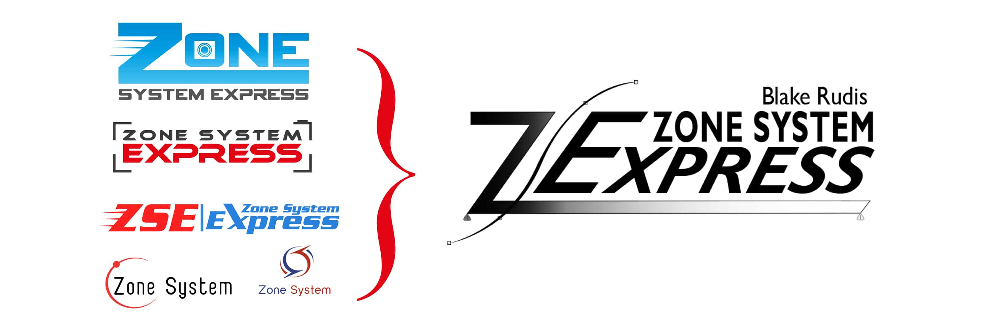
f.64 Academy went through many brand changes before it became what it is today.
I wanted something that would emulate laser targeted, high-quality photo education, and be an homage to my favorite group of photographers, Group f.64. What I came up with was clean and neat, but lacked the elegance that I wanted. With the lack of time and the need to keep on moving, I settled on it and just kept on moving.
Recently, I have been discussing logos, brands and many other things with a peer group. On two occasions my logo and design skills were brought up and that I might want to consider a designer to look at my brand and help me solidify it. As hard as that was to hear, I accepted it and decided to rebrand f.64 Academy.
Where do you start with a rebrand?
In the past, I used fiverr.com to solicit designers for the Zone System Express. On Fiverr, you can pay someone to do just about anything for you for $5. However, there are some stipulations with your request that can quickly turn $5 into $50. In the end, you may only receive one or two designs, have limited interaction with the designer and you are kind of stuck with what you get.
I spent about $200 on Fiverr between four artists for the Zone System Express Logo. I was not happy with any one of them, but I used some of their design elements to refine the ZSE logo. In the end, I was happy with what I came up with, but I needed to see some other elements of design to come up with what I wanted.
For my new logo, I did not want to use Fiverr again. I did not want to see a series of designs that weren’t quite what I wanted and have to do it myself. So, I listened to my peer group and checked out a site called 99 designs.
99Designs – The Concept
99designs provide the customer with an interesting design seeking experience. At first, I was a bit mystified by it and after making my purchase I was in immediate buyer’s remorse because I had no idea what I had gotten myself into. I was under the assumption that I would receive 60 designs made by one or two designers at a design firm (I went with the $499 tier). However, I was far off with my assumption!
What 99designs does is provides a contest for many designers to jump in on. Once you setup your profile and your brief for your design idea, it goes out to their designers who are waiting on standby to create your design. Within minutes of creating your “contest”, you will begin receiving design ideas. This contest will run as long as you have allotted it to. The longer it goes on, the more designs you receive.
While the contest is going on, you can rate the designs coming in, send messages to the entire group, or send messages to each designer. The designers can take your suggestions and modify their designs throughout the entire qualifying round. It is imperative that you remain diligent during this time because a ton of designs will be coming in and you have the opportunity to weed out the good from the bad.
Once the qualifying round is over, it is time to select the finalists. You can select up to 6 finalists. During the final round, the selected designers get the opportunity to refine their designs based on your suggestions. At the end of the last round, you have to make your decision and notify the winner.
99Designs – The Strategy
There are some strategies you can use to get the most out of your 99designs contest. I used these strategies quite a bit and wanted to share them with you, so you get the most out of your experience and ultimately, the best design for your buck.
- The Brief: Be very explicit with your details in the brief. The designers will be using this information to make your design. I said very sternly, absolutely no aperture logos and I am not looking for literal designs with cameras. Implied is okay, but I want something clean and professional.
- The bulk messages for designers: Utilize these to your advantage. They are meant for you to announce to everyone what your expectations are. In the qualifying round, I sent out four messages and announced why I was declining some of the designs.
- The rating system: At the beginning of the qualifying round I did to give out more than 1 or 2 stars. I saw a trend that when I gave a 4- star rating all of the designs that came in started to look like the 4-star rated design. I quickly reduced any rating higher than two stars to get more original designs in the door.
- The decline button: Use it, and use it often. The last thing you want is for a designer to go down a rabbit hole you do not want them to pursue. I declined anything with an aperture in it and anything that looked exactly like my current logo, but with a different font. Anytime I rejected a round of designs I made sure I let the designer know why and sent a bulk message to all the designers.
- The Polls: Polls are excellent in 99 designs. You can select up to 8 designs to make a survey that can be shared with a simple link. I made one poll during the qualifying round and sent it out via social media only and received a total of 69 votes. Not bad since my Facebook pages are not huge by any stretch of the imagination. I also sent a poll out to all of the f64 Academy subscribers during the finalist stage. Over 1100 votes came in, which was very helpful in my final decision.I liked the poll concept because it gave others a chance to rate the designs and give their 2 cents on them. I was shocked by the great feedback I received, but some of you, wow, you have some hate built up in you! You might want to consult with a comfy couch and someone who can talk you through that. Whether the remarks were constructive or destructive, I was grateful to receive such a turnout for feedback. Thank you so much for participating!
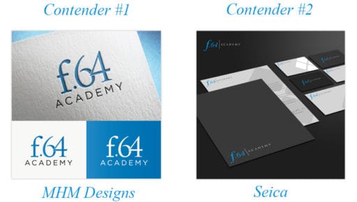
- The Winner: This was the hardest part for me. I was torn between two. The first logo was one that everyone gave the most stars to; they liked how clean it was and how it popped out at them. The second Logo was my personal favorite and the one I ended up picking.I learned a lot from the polling. I found out that the type of design image is critical to those who are picking their favorite. If you look at the two contenders, the one on the left is clean, shows the logo on various colors (branded f.64 colors) and also how it might look on a business card. Contender #2 decided to focus less on the logo and more on the application of it. For the most part, the 2 and 3-star ratings it received were because people assumed the logo was going to black, or that the logo itself was stationary.
 When you are picking your winner, go with your gut. Use the poll as a guide, but ultimately make the selection you are most comfortable being “married” to. The pollers won’t have to look at the logo the rest of their life, but you will!
99Designs – After Action
After you select the winner, there is still a bit more to do. You have the option to communicate with your designer. I highly recommend you do so. They will send you a Zip file with all of the documents associated with your logo, but they may not include an editable PSD or AI file. If that is the case, be sure to ask them what fonts they used before you sign the contract and send it all over. You may need the font for variations of the logo or for branding your other sales material or your site’s font to match the logo.
After selecting the winner, I did some tweaking to the logo and am very satisfied with the final logo. You should see it phasing in on the websites shortly.
In Conclusion
I am sharing all of this information with you because it is critical to get your logo to match your brand. Your logo (or branded text in this case) is one of the most important elements to your business. It is the mental trigger or the light bulb that flickers on when someone sees a reminder of your product or brand.
You may think I am crazy for spending $499 on a logo design when I already had one. I am not mad, and I would do it again. Why, because that little bit of refinement taught me a lot about design and where my previous logo would have measured up. In the poll, I purposely put a logo in that looked like my old one. It got 2.2 stars; people called it “dull,” “boring,” “bland,” and “not exciting”.
These days there are thousands of options to get a logo made up. You can do it yourself in Photoshop, phone a friend, find a branding agency, use Fiverr, or as I have recently learned, run a contest on 99designs. Looking back, I have used them all!
I like the 99designs option because it gives you options, lots of options, and flexibility. You get the opportunity to connect with the designers, and in the end, you get what you put into it and could have an incredible new logo. It was money well spent, and I will more than likely do it all over again on future projects.
What was wrong with the last logo?
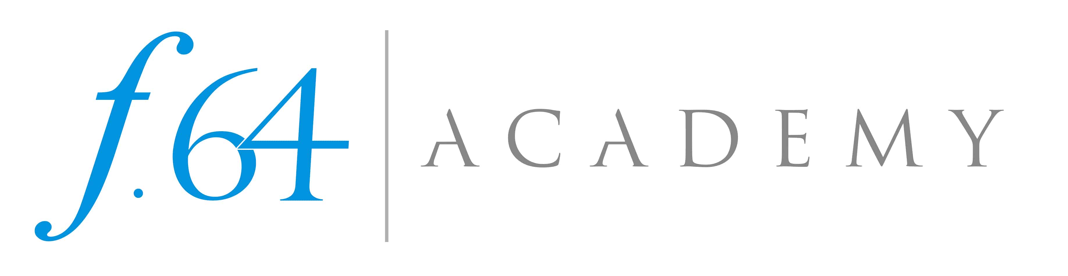
After looking at over 130 logo designs that came in for the 99 designs contest, I realized that the old logo had some design flaws. I took a long hard look at the old logo and came up with several issues that could have made it more effective.
![]()
- The slanted f didn’t fit in with the italics of the 64. It felt more stable, and half rested than wanting to commit to italics.
- The bevel and emboss on the f.64 is dated. Modern design is more flat with very little embellishments on the text.
- The line under the Academy goes too far to the left. It should either line up with the A or the dot above.
- There is a white stroke path around the Academy to make it appear thinner and stand out on backgrounds other than white. This is another dated technique on text and is not a necessary embellishment.
- The spacing between the letters on Academy looks much better with a little bit of breathing room between them.
- The drop shadow under the f.64 is another dated embellishment on the text. Less truly is more!

For Blake, it's all about the art and process synergy. He dives deep into complex topics and makes them easy to understand through his outside-the-box thinking so that you can use these tricks in your workflow today!


Since you asked, I think you made a mistake … I thought the one you chose was the worst of the bunch primarily because it was not scalable in my view. I guess it does have the advantage of making people stare at it for a few seconds before they can figure out what it is, especially at a small size, but that’s the only thing that might recommend it to me. Of course, you’re the guru and what do I know? I do appreciate the extensive post on what, why, and how you went about it …
I like the new logo. It is clean, it works on every application I want it for and it is much more refined from the original. It won’t be everyone’s cup of tea and that is okay. It doesn’t overly imply photography, which is what I wanted for upward scalability in the business and it checks all the boxes I had. I am happy with it.
I think you made a great choice! What an experience that must have been! You put a lot in to it and that is the key. It shows!
I have visited ’99Designs’ and kinda got the gist of it. I wasn’t in the market for anything, though. Thanks for sharing your experience with them with your logo design!
Thanks, Su. I thought it would be less work, haha, I found out the hard way. With 99designs you really have to stay up on it or it goes all over the place.
Blake, I love your final choice. It was my choice when I reviewed the list of other design options during the poll.
Phew! I was hoping, I’d hear that 🙂 There were over 100 for me to choose from and that one just spoke to me from the beginning.
BR: Very in-depth and informative tour of the 99 Design experience. As with your PS and photography videos, you are thorough and deliver information with great clarity.
Design taste is a very personal thing, based on innumerable esthetic, emotional and perceptual factors. Ask a thousand people, get three thousand opinions. I know from presenting ad campaign concepts for over 20 years.
And, yes, the vehemence and vitriol in some observers is similar to today’s politics.
In the end, you found a design that satisfied your criteria. Assignment successful.
Thank you! I couldn’t agree more.
A mix of 1/4 from first contender design, 3/4 from the second contender, no real font or colour CI etc. At least you’re happy, no step further or improvement but.
Thank you!
After recently going through the anguish of creating a brand. I fully understand what you’ve gone through to get to a happy place! At first glance the embossed card stock of contender #1 got my attention right away. Its classy and contemporary, and in no way garish. I wonder if a drop shadow to simulate the embossed look would help to create the same look on plain paper as it looks on the card stock? Just a thought! I often approach a new project thinking “If someone else can do that, than I should be able to also”. Sometimes it’s best to stay out of the deep end if your not a good swimmer! I like your final choice!
Awesome! Thank you very much for your supportive input.
Hi Blake – I enjoyed looking at the logo choices and it was fun making my decision on the design. I was torn between the #1 & #2 contenders. I went with the #1 contender, but in my mind I wanted #1 in one line, f.64 | Academy, just like contender #2. Thank you for letting us participate.
I’m glad you are happy with your choice, that’s what counts in the end!
Thank you very much for your supportive comments and help making the decision. I really appreciate it.
WOW! All that for a logo? The old one didn’t bother me at all, but this one is fine –as long as YOU are behind it! Are you going to redesign the T-shirts,too?
Yes I will be doing that soon. Thank you!
Woohoo! I love your choice, it was my first choice as well. It stood out to me from the beginning as clean, professional, and a little bit fun too. Great choice.
I also loved reading about how you picked it, the whole process. As someone who is interested in typography and has studied it somewhat, I enjoyed this poll and your journey in finding a new brand.
Thanks for letting us be a part of it!
Awesome! Thank you so much for your supportive role throughout the process. If means a lot.
Like it very much…clean, elegant, straightforward, simple, minimal embellishment, says what you want it to say and no more!
SWEET! Glad you like it too 🙂
Boy oh boy! I picked the winner as well! Starting to see things like Blake Rudis! Now THAT would be the day!
It would be! Then I know that all of my hard work in educating paid off and you could be the new teacher and I’ll go into retirement 🙂
Thank you for sharing your process.
I think that your new logo looks really good. I might have tweaked a couple of small details (have the 6 and 4 not touching, keep your original font for the word ACADEMY) but kept the basic design as the one you adopted.
When I voted in the poll for the top 5 contenders, I rated my preferences with 1 to 5 stars in increments of 1 star, and critiqued each one, but kept it civilized. The final scores reflected my own personal preferences.
Thanks, John! I appreciate the input. I did like the 4 over the 6, I thought it was a nice touch to make it somewhat different and memorable. Thank you for all of your input during the polls too. It helped seeing constructive critiques!