
Color Matching – Color Grading
I recently received an email from Wayne, an EverydayHDR subscriber, asking me about Color Matching the palette of one photo and applying it to another. Here is his inquiry:
It has me wondering if there is some way to take a colour palette from a picture whose palette I like and transfer it to another picture of mine so I can get the feel and mood in the one palette into another. I realize I would have to be careful to use a new palette so it is believable in the new photo.
I came up with 2 methods to do this based on Wayne’s request. Watch the video tutorial at the end of the post and get the Actions!
Option 1 – Color Match – Color Matching
I love a good challenge and Wayne surely got my gears spinning in a fun direction! I remember a few months ago I was playing with this very idea using the Match Color feature in Photoshop. It is not a common adjustment that we use as it is hidden in Edit– Adjustments– Color Match. Using this tool you can essentially steal the color palette of one photo and add it to another. This method has its pros and cons of course.
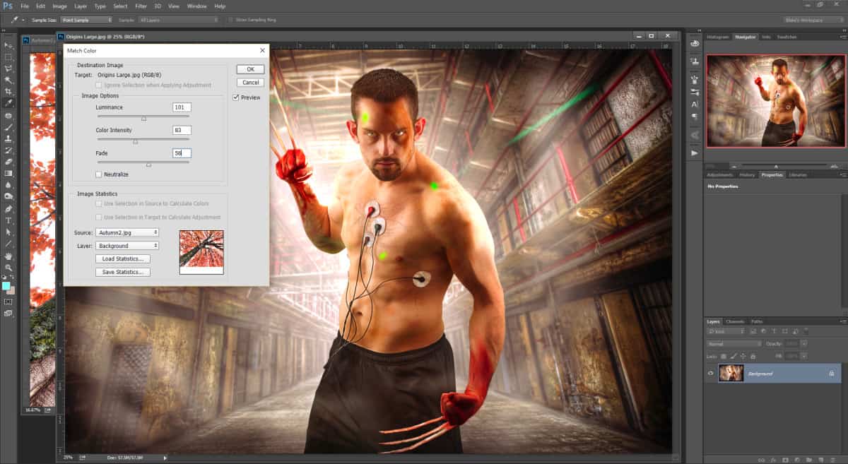
|
PROS |
CONS |
|
Quickly and easily matches the color palette of one photo to another |
Can be destructive if you do not duplicate the background |
| Simple tools to match the color – Luminance, Color, Fade | Not quite as many tools as other options for color matching – limited use |
|
Can be difficult to remember where to find the tool |
Option 2 – Gradient Map Color Matching
The other method I describe in the tutorial uses a clever way to break an image up into its main colors and apply them with a gradient map. If you have been following the blog long you may find this familiar as it uses similar steps to a Topaz ReStyle technique to find the perfect preset for an image.
This method starts by breaking down the image you would like the palette from. It breaks it into 5 or 6 color blocks, almost like a painters palette after a long day of painting! From there you take the colors you would like and attribute them to a gradient map. This grants you the ability to apply certain colors to certain tones in an image.
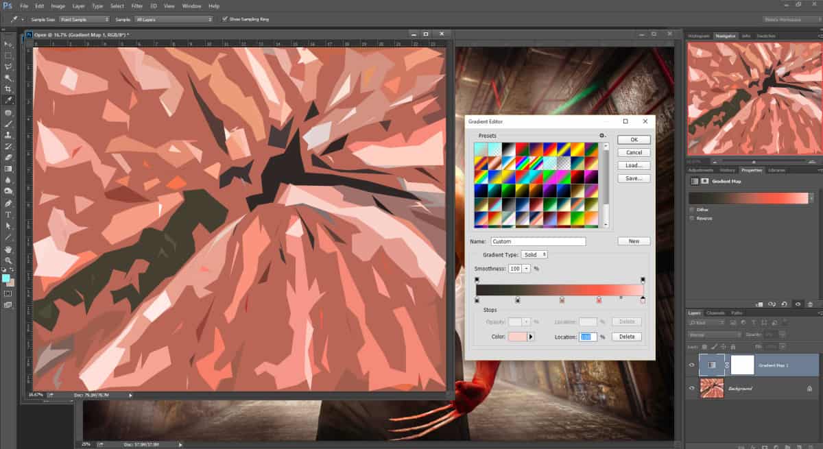
| PROS |
CONS |
| Nearly unlimited control over the colors being applied | Can be difficult to remember how to make the color palette |
| Non-Destructive in nature | Not for the PS faint of heart, but can be taught |
| When applied with Blend if and Blending Options this method shines | |
| If you save the gradient you have very quick access for future photos |
Which Color Matching Option will you choose?
Take a look at the video below and be sure to grab the Actions!

For Blake, it's all about the art and process synergy. He dives deep into complex topics and makes them easy to understand through his outside-the-box thinking so that you can use these tricks in your workflow today!


Blake, Another great tutorial! You have introduced me to so many new concepts through your tutorials and I really appreciate it!!
Sweet! Thank you so much for the feedback. I am pleased I can teach you new tricks.
Thank you so much for “Color Matching in Photoshop”. It will take me awhile to learn both ways and I intend to do so. When I do, I will send you a copy of something I like.
This is exactly what I was looking for.
Wayne
Sweet! So glad this was what you were thinking when you emailed me. I had a feeling, but I wasn’t quite sure this would do the trick. Topaz ReStyle is another program I failed to mention here that can do something very similar within the plugin itself. You can select an image for it to analyze and adapt the color palette accordingly.
Wow! Thank you for another creative idea for the arsenal.
Both methods have merit. The first is something that can be done quickly, say in front of a client to peak their interest.
Since I am more of a control freak when it comes to an image, the second method will be the one I will use more.
That is a great way of looking at it. The first way as a Mock-up and the second way as a more intuitively controlled method. You can also combine them, that may make for something interesting as well.
Great tutorial this is. Makes me wonder after more on Topaz Restyle if and how it is possible to import colorthemes (the 5 colors) from the Adobe PS CC Library or directly from the Adobe Color App on Smartphone to be used as presets in Topaz Restyle? Would be great if this would be easy to manage.