
What’s the Difference with the Difference Blend Mode?
Over the last several years I have explored many of the blend modes in Photoshop for color grading, but I haven’t touched on the Difference Blend Mode. A lot of what happens here on f.64 Academy is psycho targeted experimentation and that stuff takes time, a lot of time! When someone says, “Hey Blake, can you explore x topic”, I do. I explore it a lot, sometimes I explore it for months. The Difference Blend Mode was one of those instances.
Taken from the Adobe Help Blog
Difference Looks at the color information in each channel and subtracts either the blend color from the base color or the base color from the blend color, depending on which has the greater brightness value. Blending with white inverts the base color values; blending with black produces no change.
I have traditionally used the Difference Blend Mode in the past for aligning layers. As the description implies, the difference blend mode subtracts the pixels of the base and blend layers and the result is the greater brightness value. Well, when you subtract two pixels with the same value, the result is black. This makes it very easy to see where images are aligned in Photoshop. If the resulting image (or most of it) is black, then you know the alignment is good!
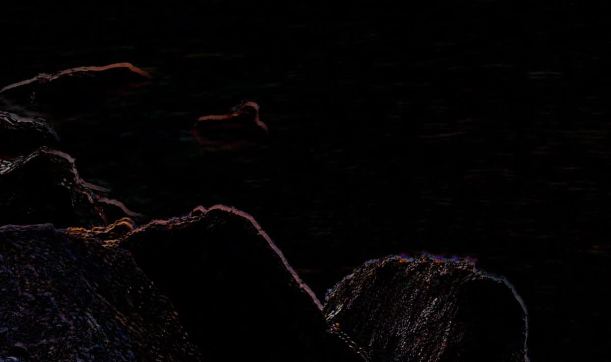
If the result of the difference blend mode for image alignment is Black, then you are good to go. If however, you can see misaligned edges (like the picture above) you know you need to nudge the image in place.
I have stumbled upon a new way to use the Difference blend mode. This blend mode can be phenomenal for color grading. The idea is to use a solid color fill set to Difference. It will apply the color to the dark areas of your photo and automatically invert the color and apply it to the highlight areas. The result is a harmonious color grade that uses the complementary color principles of Color Theory to create a natural color grade.
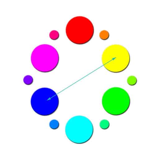
Don’t be fooled, it is not as simple as it sounds. the Difference Blend Mode can be slightly unpredictable. You have to be thinking in terms of opposites at all times! If you use red, the primary color grade will be cyan. If that red has a bright value it will make the image darker, and if it has a dark value the result will be less in the highlights and more in the shadows. I suggest relying on pattern recognition and really experimenting.
The biggest take away here is that the Difference Blend Mode relies heavily on the FILL slider. Fill will act as the calculation of the math that happens within the blend mode and Opacity controls the intensity of that calculation.
To make it easier, I have made a video and a series of actions to assist you in your understanding of the Difference Blend Mode.
Download the difference Actions

For Blake, it's all about the art and process synergy. He dives deep into complex topics and makes them easy to understand through his outside-the-box thinking so that you can use these tricks in your workflow today!


Howdo I get your actions?????
Wow! I knew about using the Difference Blend Mode for pixel alignment, but using it for for color grading is an outstanding creative use. As usual you made a difficult subject easy to understand. Thank you!
There is a giant Orange button that you can click on above the video. The Actions will auto download.
interesting
Blake great job. I especially liked how you explained the difference between Fill and Opacity. I have started using fill since your hard mix videos. But I did not under stand what fill was. Thanks and Keep up the good work.
I have used color difference before but not in the bold creative way you have here. It also reinforced my knowledge. Thank you for the possibilities.
Awesome! thanks for stopping by 🙂
This tutorial is unique. It really makes the difference, especially the way it’s filled with just enough information to provide a stimulating amount of knowledge in an area that has always been somewhat opaque.
Thanks, Marc! I really like the possibilities with this one!
You could’ve also mentioned gradient colours too.
They are not predictable at all with the Difference. The difference is essentially creating an automatic gradient. Adding a gradient too it is very unpredictable and can get muddy very quickly. During my experiments, I found the Solid Color the best route.
Very Clever! You never fail to amaze me with your new ideas. The difference blend mode did not, I thought, a more than minimal use. Until I saw this vid. You never fail to amaze me. Good stuff!
Cheers,
Roy
Thanks, Roy 🙂 this is a neat Blend Mode now!
Blake, it’s been said too many times, but you rock! Thank you for doing the the experimentation that I might have done 30 years ago.
Thanks, Terry 🙂
Wow. Terrific! Thanks for the effort and for sharing.
It is my pleasure!
Blake, this really adds a great amount of flexibility to getting colors the way I want. The issue I’m having though is when I try to flatten the image it goes back to looking like it did before I started. It’s almost like flattening undoes the effect and when I try to keep the layers and export for web the same thing happens. Any guidance would be appreciated!!
That is pretty weird. Try making a stamp of all the layers on the top first, then flatten. CTRL+Shift+Alt+E will make the stamp, make sure you have the topmost layer selected. Then flatten
Blake,
I am having the same problem and it also occurs when I make a stamp.
—Lisa&
In other words, when I make a stamp the result of the stamp is the same as if I flatten the layers. Which is a shame, because this is a wonderful technique.
From what others have mentioned this may be an issue when using an image pulled in from Lightroom and also with Adobe Camera Raw I am seeing.
It appears to be a relatively new Photoshop bug. It doesn’t happen on JPEG files or even 8-bit images. But a 16 Bit photo it causes some trouble. I will submit a ticket with Adobe to take a look at it.
i think i got the solution….i need to run a couple of test and will post
Thanks for the explanation on how to use for alignment. I’ve heard of it before, but not explained so well.
Awesome! Glad I could help.
The link to download the actions does not seem to work ???
That is odd. I just clicked on the Orange button and it auto downloaded it for me.
The action link worked perfectly for me
I have viewed most of your tutorials and for me this tops the lot. Great for changing the mood of the image. Thank you.
Awesome! Thanks so much, Ted!
lovely and very helpful video.
Thanks!
🙂 thanks!
Amazing! I have used the difference blend mode in my artistic work many times, but did not fully understand the full capacity of it and how the different colour scales were working “simultaneously”. Thanks so much for the clarity and for providing the ACTIONS! I am really grateful! And for me also, I was NOT aware of the difference blend mode working to help me align stacked images. That was an EXCELLENT tip as well. You ROCK Blake!!!
So cool! Glad I could teach you some new tricks. The image alignment trick is gold! That one I use all the time. Now I am using the Color Grading more and more as well.
if u merge or com-opt-shift-E the image will noticeably change. is there a way to save as one layer without shift of color?
I will look into it. I have not replicated your issue yet.
i think i got the solution….i need to run a couple of test and will post
Go to image/Mode and set to 8 bit, problem solved.
Great tutorial Blake!
Fantastic as always, Blake. I definitely have to try the color grading. I usually stay away from it but this technique makes it so much easier and more subtle.
All the best and thanks for all you do,
Vinny
Thanks, Vinny! Give it a shot 🙂 Color grading is a huge part of artistic styling. You should give it a g more often!
Thanks for checking it out!
Wow!
LOVE this! Thank you for another great, informative, easy to understand tutorial ..
It is my pleasure, thanks for watching!
Blake you did it again. what a wonderful action
🙂 thanks, Leon!
This is a brilliant tutorial, as always, Blake.
What you put out is simply fantastic
Thank you so much for the feedback. I strive for excellence, glad to see I am getting there!
Blake, just experimented with this and I really like the results. However, I am seeing some problems:
1) Zoom in anything greater than 66% and the effect disappears.
2) Make a top-level Stamp layer and the effect disappears.
3) I see the same problem that Mark Altmeyer previously mentioned above.
Any help with these issues would be appreciated.
That is weird. I have tried all of the above and have not had any issues. What operating system? Are your video card drivers up to date?
From what others have mentioned this may be an issue when using an image pulled in from Lightroom and also with Adobe Camera Raw I am seeing.
It appears to be a relatively new Photoshop bug. It doesn’t happen on JPEG files or even 8-bit images. But a 16 Bit photo it causes some trouble. I will submit a ticket with Adobe to take a look at it.
OK, still not exactly sure what is going on but I found that it depends on how the image was originally opened. If I open the image up in Photoshop via Lightroom I see the problem. If I open the same image up directly from Photoshop I do not see the problem.
I’ve been doing my Photoshop editing like this (i.e., via Lightroom) for several years now and have never seen this type of problem before.
That is very odd! I have never heard of that. Have you updated Ps? Updated graphics drivers?
Dave – I am having the same problem. I was using a dng file. When I open this file from Photoshop, I do not get the choice of editing with or without Lightroom adjustments. I did some experiments with RAW and jpg files. The technique worked fine when I would open the image without Lightroom adjustments, but I would encounter the merge/flatten problem when I opened the image with Lightroom adjustments.
From what others have mentioned this may be an issue when using an image pulled in from Lightroom and also with Adobe Camera Raw I am seeing.
It appears to be a relatively new Photoshop bug. It doesn’t happen on JPEG files or even 8-bit images. But a 16 Bit photo it causes some trouble. I will submit a ticket with Adobe to take a look at it.
tested the gray scale with the color layer in difference. when i flatten or merge layers there is a strong color shift. how can i save changes in one layer?
I do not know why that is happening. I am not having the same issue so it is very difficult for me to replicate it on my end and help.
i think i found how to save with out reverting to original, will post soon
Once again, fantastic explanation – love the way this blend mode works and how creative it’s use is.
Thanks.
Awesome! Thanks for the feedback, Julie!
Blake: Thanks, this is AWESOME! I am just getting into IR photography and your actions should help me get better at my IR processing!
IR is fun! Glad I could help.
Brilliant Blake. This information has just added another arrow to my post production quiver. Great stuff!
It’s been said many times by me in the past and again echoed here by others but you are a phenominal teacher.
I have just returned from a workshop where I took several dawn and dusk images. Having downloaded your actions I can alter the mood of the images to what I felt at the time. Brilliants. Thanks.
I also am having the problem merging/stamping layers. The problem is solved when I bypass photoshop. I am running MACOS (latest) on a Mac Mini. As far as I know, my video drivers are up to date. My Photoshop Lightroom applications are definitely the latest versions. I was editing a dng file. The dng files do not give me a choice to edit in Photoshop with or without Lightroom adjustments. I played around with some jpg and raw files. These file types do let me choose between editing in Photoshop with or without Lightroom adjustments. The technique worked perfectly if I brought the file into Photoshop without Lightroom edits. But, when I would bring the file into Photoshop with Lightroom edits, I would encounter the merge/flatten problem. So – there you go. Still the technique is worth the trouble of editing straight in Photoshop when I think I might want to use it.
Thanks, Lisa! It seems to be a glitch with the 16 bit image. Any photo, when set to 8 bit it will work.
the problem: when flattening or stamp visible (com. opt. shift E) an image with layer in blending mode_ difference, the changes will revert to the original
problem has nothing to do with lightroom or bit depth
solution: to flatten use instead: layer>merge layers, all information will render properly
HI Blake
As usual, a fantastic video with such a great explanation to boot. Thank you for sharing your knowledge and your resources. God bless you for your generosity!
Good grief! LOL You have this way of explaining stuff to where it actually makes sense! Cool! Makes me feel smart! LOL
Thank you, sir!
Su
Hi Blake,
Thanks for all the helpful tutorials. The download link for difference action is not working.
Hi Blake, another amazing video tutorial and actions set, you rock !!
Many thanks,
Rob.