
Light Interface, Dark Interface, does it matter?
I have been doing quite a bit of experimentation on this Photoshop interface topic lately. It seems most companies have evolved from a light interface to a dark interface. If you remember back to Photoshop CS 5 the interface was a light grey and there were no options to change it.
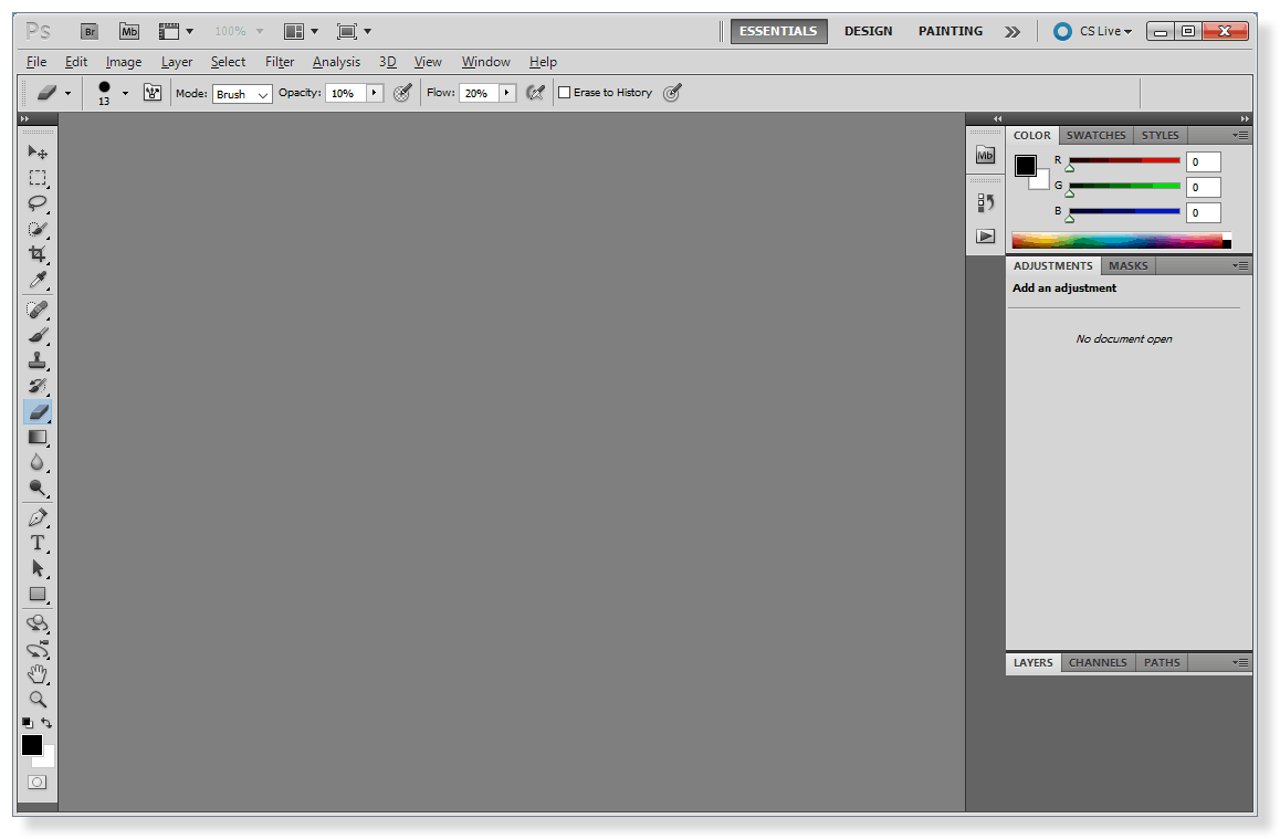
Photoshop CS 5 Interface… brings back memories for some of us!
In Photoshop CS 6 the interface received a makeover. It was quite a shock to me. I can remember thinking to myself, “I love this new look to Photoshop, but will it have an effect on how I edit my images?”
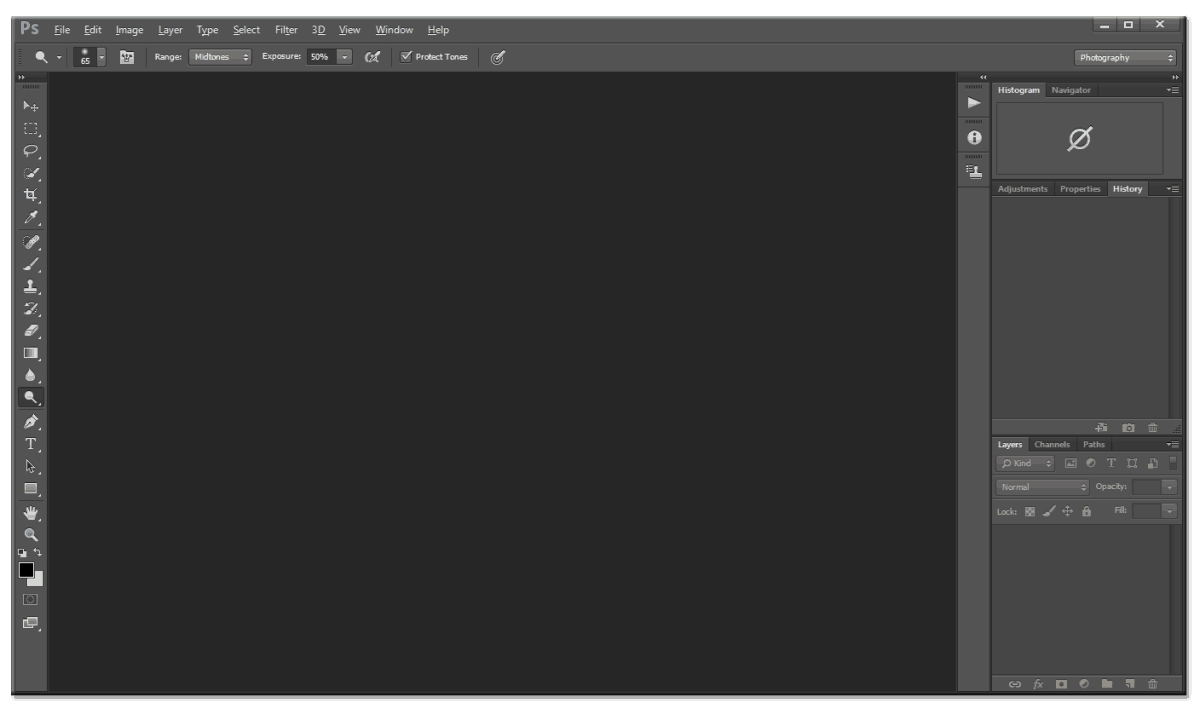
Photoshop CS 6 Interface… not so far off from CC, with the same interface options as CC now.
I was drawing this theory from my days in College where we focused on Color Theory, similar to the paintings of the great Mark Rothko. While many think his paintings were ridiculous Rothko was onto something with his approach to color theory. He would create huge canvases, some more than 15′ tall of a solid swatch of color and he’d apply a smaller swatch within it of a different color. He made many of these. If you have ever seen one in a museum you know just how powerful they can be.
What does this have to do with Photoshop?
Everything! Similar to Rothko, I too was onto something with my thoughts on the Ps Interface and photo editing. I made a comment about it on my “What’s new in CS 6 video” and while I thought it was great I received this comment.
Expletives have been replaced with *&^&*
“What a pretentious *&^&*stick…. ooohhh the 80 percent grey might interfere with my processing capabilities. Too soon to tell though. We’ll just have to wait and see. Do you even listen to yourself after you do a video dude? You sound like a *&^&*. Suck it the *&^&*up and *&^&*‘. Somebody loves the sound of their own voice.”
While I try not to let comments bother me too much, that one struck a chord with me. Maybe I was a bit pretentious to some, I was being honest in my approach to the introduction to the new interface. I did let that comment affect me, as a matter of fact of all the comments I have received that is the only one I can quote verbatim. It took the wind out of my sails. That was 3 years ago.
Fast Forward to today.
I decided to finally drop that *&^&*sticks comment and test my theory from so long ago.
The Hypothesis: Will the interface chosen in Photoshop affect the Tone and or Color choices during the editing process?
The Test:
- Make color swatches of the two Photoshop Interfaces side by side.
- Apply a color in the center of the swatch and see how it is affected.
- Edit the exact same image on both interfaces to see how they are affected by the surrounding interface.
- Only modify Tone, Color, and Finishing Color Grade
The Result:
- Each image looked significantly different dependent upon the Interface in Photoshop
- The Light Interface seemed to produce subtle images, slightly washed out and desaturated in nature.
- The Dark Interface produced images rich in Saturation and Tone.
Feel free to download the PDF of my tests below and watch the video to see how the whole test panned out. I highly suggest trying this on your own to see how the interface can and will effect your editing practices.
Like the style of this tutorial? You will LOVE HDR Insider! Full-Length HDR Workflows, Critiques & More!
![]()

For Blake, it's all about the art and process synergy. He dives deep into complex topics and makes them easy to understand through his outside-the-box thinking so that you can use these tricks in your workflow today!


Hi Blake
You should also consider where the print will be hung.
Offices could be using florescent lights a shop interior could be using Halogen and the home may have a mix and, not forgetting the background wall colour could well have a dramatic effect on how the print looks.
Yikes!!! Another thing to consider. I don’t think when processing or painting a picture there is anyway to consider all the light options of where it might hang. When I hang a picture, I do consider these and may change the wall color, lighting or better still add an art light above the picture. Or, if I were opening a gallery I’d want the perfect lighting.
Excellent point!
Thank you so much Blake for this great information.
No problem Barb, thanks for watching!
… there is a saying amongst my family: “are you picking fly-shit from pepper?”
I do not see the same differences and I wonder if it’s due to your age and mine, or, the fact you have more color experience, or the simple fact you and I do not see the same image?
I owned an offset printing company for 36 years. Whenever I checked film negatives for uncovered “pin-holes” I could see ’em while one or more employees had to squint or use a power-glass.
Some square color box (light VS dark) comparisons really did not matter and “light VS dark” photo images illustrated more pronounced difference, it wasn’t enuff to shake the earth.
Your work is based entirely on experience; not to be sneered!
Mine work is basically a matter of pleasing the client!
Do not stop whatever you do; I learn from you in spite of not always understanding your view point.
Kindest Regards,
Marvin
Thanks Marvin. I see clear differences. Did you download the PDF to take a look at them?
I can see what you are saying and the differences may be so small they don’t matter. I see them and it makes me think like this.
I appreciate your honesty.
An eye opener. Which do you use? does it matter if you print on a bright white paper vs a warmer paper?
I saw the differences – which were clear but not obvious (I didn’t look at the PDFs only on screen). I do wonder if the colour capability of people’s monitors might be adding another layer of distraction. I know my ordinary Dell monitors are specified as 77% sRGB gamut, I wonder if a ‘photographers’ monitor, say 99% RGB, might not make the differences clearer?
Me again. Purely by chance I have recently upgraded my main monitor to a Dell Premium Colour (99% RGB, factory calibration) and I can confirm that the differences between light background/dark background colours are a little more obvious.
I see the difference. This is probably the reason that I sometimes put a temporary matt on the top layer when I’m doing final adjustments on a photo.
I agree that the editing ColorSpace does affect the final photo. However, I also feel somewhat disturbed by this information. It will take some work and experimentation to integrate this into my workflow
Maybe *&^&*stickwas just intimidated by you. It’s amazing to me how mean some people are. You are always generous, kind and helpful. Why can’t people just say thank you for all the knowledge you share?
It’s all good, people will be people. With some people Internet comments are like graffiti, they put them out there to make their mark and don’t care who it affects. It’s very easy to say something inconsiderate rather than something helpful.
What an interesting experiment. I do have issues sometimes with my images printing darker than what I see on the screen and I calibrate my screen regularly. I think the explanation you gave for this makes a lot of sense. I will try this experiment myself with some of my images. Thank you very much for your time. I for one really appreciate it.
In his book Adobe Photoshop CS6 for Photographers, Martin Evening shows two versions of a photograph he edited, one using a white background and the other using a black background. When viewed side by side you can clearly see the difference. He states: “As you can see, although these image views each looked fine when viewed against a black or white background, when you compare them side by side, you can see that the canvas color choice has had quite an impact on how the image was perceived when making those all-important tone adjustments.” Although the current trend in programs like Photoshop and Photo Mechanic is dark backgrounds, Martin recommends a medium light gray theme which is what I have been using.
Very interesting. Glad to see I’m not the only one concerned with this!
I never would have thought of this, especially the part about printing and the color of the background/mat board. Thanks very much!
Vinny