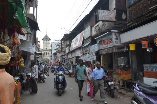
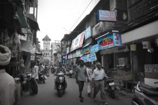
There is one thing I really enjoy about my job, I get to meet people from all over the world. Granted it is usually in the form of email, but at least it isn’t spam 🙂 I have been talking with Manashree Parekh about how to make the signage in a photo become the center of attention. I thought the request was interesting as the signage is usually the last thing I pay attention to in the city.
Signage, however, is a form of design, a form of art that I continually bypass as I look around. Is it because I am inundated with advertisements all over America? More than likely, but the challenge of making the signage the most important aspect of a picture sounded like an interesting task!
In this tutorial I will walk you through how I made Manashree’s signage pop off the page. You can use this technique for much more than just signage. It is universal for many applications and holds more value than just selective color, which after seeing 2 or 3 of them they lose their cool factor pretty quickly!
If you liked this tutorial, check out HDR Insider! I do Full Workflow Tutorials and give away Photoshop Actions every month!
![]()

For Blake, it's all about the art and process synergy. He dives deep into complex topics and makes them easy to understand through his outside-the-box thinking so that you can use these tricks in your workflow today!