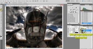
There over 7000 functions in Photoshop and over 6 billion people on Earth. If everyone in the world were given the task to post process an HDR image in Photoshop (given they had the knowledge), that would yield over 42 Trillion different post processing combinations. I am going to show you how I go about post processing, keep in mind there are 42 trillion ways to do it. These 2 examples I am about to show you are used in almost 95% of my workflow. I am sure yours may be similar and you may have a better way of doing them, we all have a better way, and as artists our way is the best! At least that is what I learned in 6 years of College!
I used Photoshop CS 5 for the processing, I have 10 days left on my free trial, then it is back to the original 2003 CS!
Method 1: Curves, Levels, and what not to do!
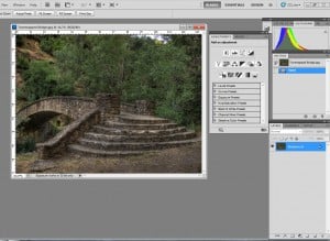
- Open your Photomatix processed image into Photoshop. I am not going to go over the Photomatix process again, you can head over to How To HDR! for a refresher if need be!
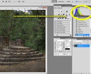
- Pay attention to the Histogram. Look back at How To HDR! if you need a reference for the detailed explanation of the histogram. Notice the histogram is skewed to the left (the dark side) and all of the colors are huddled together. Now look at the image, all of the colors appear to be running together in a sort of Medium gray, coincidence? Nope! We are going to pull those colors apart a little bit and bring out some more depth in this image.
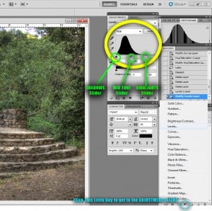
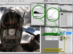
- Do you see that little black and white circle at the bottom of your layers palette? That is the Adjustment Layers Icon, you can do some pretty powerful things with the adjustments there. We want to concern ourselves with the Levels Adjustment Layer first.
- A pliable Histogram will now be prompted, don’t hesitate! Have some fun! The triangle on the left of the histogram controls the darks, that must be why it appears black! The gray triangle manipulates the mid tones in your image, I am starting to see a pattern here. The white triangle, that controls your lights.
- Notice the large empty space between the end of the bell curve and the edge of the histogram. That empty space is indicating to us that there are not enough Highlights in the image, or at least the highlights are not receiving the attention they deserve. Play with that white triangle, throw some more light in the mix(move to the left for more highlights and to the right for less)!
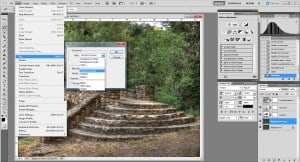
- Now we are going to go back into the Adjustment Layer Icon and select Curves.
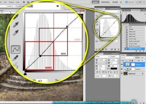
- Here we are with a 300% blown up diagram of the Curves adjustment layer.
- This is one POWERFUL tool, it can be very helpful but can also be very destructive. Not like you can’t press undo, but you get the idea. I make a small S curve 90% of the time this is a killer depth contributer. The bottom left quadrant of the Curves box adjusts the Darks in your image, the Upper left your Highlights, and the Middle quadrant controls the mid-tones.
- For this image a small amount of shadow was added as the image favored the muddy grays. I added a substantial amount of manipulation to the highlight portion of the curve, you could tell it needed it!
- I rarely adjust the mid tones in the curves.
- I must advise: all images are different, what works here may not work on others, it depends on your eye and your desire for the image. That is key! Always remember it is your image, edit it to your hearts desire, but sometimes it is good to have a second set of eyes. Like mine for instance, please don’t do this:
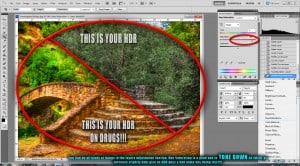
- I did mention that the Adjustment layers were powerful, here is an example of the saturation in an image gone bad.
- I have mentioned many times in the blog that I was equipped with an instinctive “That Is Too Much Saturation” 9 volt battery on the tongue effect that takes place in my mouth when I see super saturated images. These are the types of images that give HDR a horrible name! Please save us all the trouble of having to explain that some HDR artists are on drugs when they process there exposures!
- After I have done Levels and Curves, I assess the rest of the image and see if I can make it better, whether it be a crop, selective focus, or even the clone tool.
- Here I have used the Content Aware fill, new to CS5. This is voodoo, magic, and somewhat miracle all blended together, there are some things that are way ahead of their time and this one blows me away! I have also duplicated the background image. If I do not like the cloning effect taking place I can always revert back to the original quickly. You can duplicate the background by right clicking the text Background. Select duplicate layer.
- Content Aware Fill is a way to fill an area with its surroundings with the touch of a button. I think it is pretty valuable and saves you some clone stamp time. I still end up using the clone stamp afterward to make it appear more random.
- If you are using the typical clone stamp method, make sure you make multiple samples, I never use the same sample twice, why? Look at someones image who has. I was in a sitting with my wedding photographer who just so happened to be gloating about there Photoshop skills when I noticed in one of their albums a chair had been clone stamped out using the same sample, you could see a smudged blur of the same sample it was a good 1.5 inch by 1.5 inch square. I was embarrassed for her.
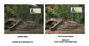
- Below is the final comparison image. Take a look at the Histograms now, the colors are more spread out. Pay particular attention to the greens which have now moved more toward the light side of the histogram. Those areas are popping out much more now and have separated themselves from the muddy gray.
Method 2: Selective Focus
- Open your Photomatix processed image into Photoshop.
- Duplicate your background layer! This is important, if you need to revert back to your original image you can at any time if you duplicate it.
- I really enjoy this gem of an image, however, I am not a fan of the background. I feel the detail of the plane should not have to compete with the clouds.
- I selected the area using the Quick Selection Tool (on the copied background layer). I know of at least 10 way to select an image, this one seemed to work best for me on this image, you use whatever method suits you best.
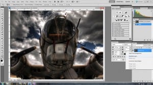
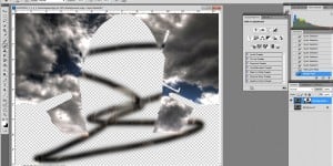
- After the area was selected, I clicked the Mask button on the bottom of the layers palette. You will notice it placed a mask box next to the image thumbnail with the plane blacked out. What we have done is removed the plane from the image, because the background layer still exists you are still seeing the plane, however, the copy layer only contains the clouds (Figure A). If we wanted more of the plane, we could paint on the mask area in white and it would begin to reappear (Figure B) or black to make more disappear. Anything we do to the background layer will only effect the clouds at this point.
- I also added a Curves and Levels Adjustment Layer to wash out the clouds a bit. I covered that in the first method, but notice the curves adjustment is dramatically different with more emphasis on the blown out side of the highlights.
- Also notice the arrow next to the curves and levels adjustment layers. That indicates to you that the only layer effected by the adjustments is the layer directly below it. We do not want these changes to occur on both the background and the foreground. That would wash out the detail in the plane and blow out the highlights.
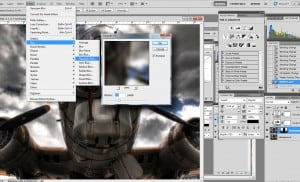
- After adjusting the layers, I used a pretty hefty Gaussian Blur to push the clouds away and bring the plane into view. I use this technique a lot with clouds. Photomatix has the tendency to make those flat blues of the sky really dirty pixelated gray. I am not a fan of that and many times find myself Gaussian Blurring it out, it usually is not to the 7.6 pixel extreme.
- And now for the final comparison image:
I have many more Post Processing techniques, but what would keep you coming back if I showed them all to you now? I hope this helped you with your post processing workflow, until next time! Take care!

