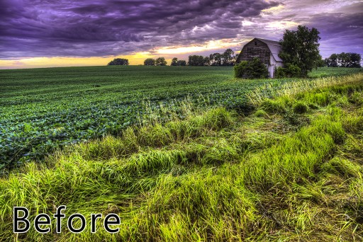
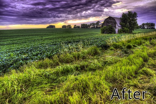
I was going through my tutorials and realized I have not shown one of my favorite go-to tricks to punch up the contrast in my color images. Surprisingly enough it requires the use of a Black and White Layer!
One of the best ways to tell if your image could use a bit more contrast is to turn it into Black and White to see how it looks. If it looks to Gray, you need to punch up the contrast of the Blacks and Whites. You can very easily create a contrasty black and white layer and use its Luminosity values to create a more effective color image!
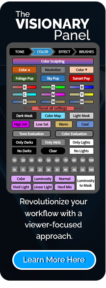
In this tutorial I will be using Black and White Effects 2 for its ease of access and relatively simple operation. Just know that you can use any black and white adjustment method you would like for this.

For Blake, it's all about the art and process synergy. He dives deep into complex topics and makes them easy to understand through his outside-the-box thinking so that you can use these tricks in your workflow today!