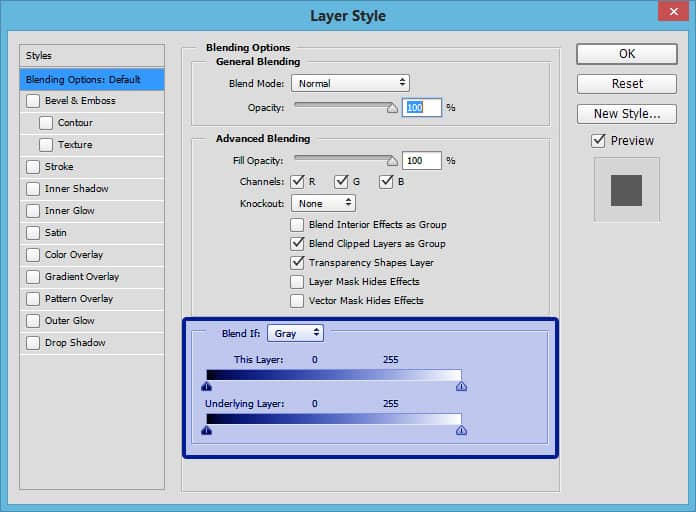
Blend if what???
There have been numerous occasions that I have gone into Photoshop, double clicked on a layer to adjust the Layer Styles and have seen the “Blend if” dialogue. I always thought, “Blend if what?”.
I also cannot tell you how many times I attempted to use this adjustment and been dumbfounded by its results. More often than not I would say, “well that didn’t do anything” or “when would I ever use this.”
Recently, I forced myself to learn it and ran through several hundred scenarios to begin to understand it. It wasn’t until I made a mock up color wheel and a black layer that I truly began to understand it.
To make it easier to understand, instead of “Blend if,” replace that with Protect… “Protect the underlaying layer” and so on.
In this tutorial, I will show you how to understand the Blend If dialogue as well as show you a real world scenario where it becomes invaluable. When Color Grading a photograph, the Blend If option is truly a life saver!


Just a detail… the oposite of blue is orange.
In the traditional color wheel it is. In my findings in the digital world it tends to be yellow. To test it, open a Curves adjustment and select the blue channel. If you lower the curve it changes the image to a yellow color.
Also look at ACR in the temperature section, you have blue for cooler and yellow for warmer.
I always look forward to your daily Email Blake.
🙂 Thank you!
As always…great information. Already know a shot I just took Wed that I want to try this on!
Awesome! Glad to see you can get right on using it!
Holy Mackerel! This was an absolutely fantastic tutorial, Blake. I am going to watch it once more to make sure I get the concept but what a great tool and a fantastic effect. I even learned something new as far as the “Copy/Paste Layer Styles”. I never knew that could be done.
Many thanks for this tutorial and for all you do,
Vinny
Thanks, Vinny!The Copy Layer Styles is critical in Graphic Design work. I use it all the time with text and fonts and shapes when I design ads and the backgrounds for my presentations like the DZS, CZS, and Exploring HDR.
Amazing technique; who would have ever figured this out without your tutorial and the results shared. THANKS SO MUCH.
Thanks, Carolyn! It all kind of came to me this week too, it just made more sense after seeing it on that illustration. Now onto figuring out even more ways this can be used!
Ditto to all the above – thank you Blake!
You are welcome Jerry!
very informative! Thank you!
No problem! Thanks for checking it out.
Your tutorials are the most informative tuts available!
I learn things about PS I’d never know about, you help me discover new techniques and possibilities for PS that I would have never considered.
Thank you for providing such a wealth of information!
Thanks, John! That is awesome feedback! I am just trying to share what I learn as I learn it. We are all growing together!
Thanks again for another fab tutorial. I will also be watching it again; and, I’m typing up notes to refer to.
“Holy Mackerel” Two-Times. DITTO!! on all the above.
Have tried the Blend If option after seeing it in other tutorials but never understood it or able to use it. Great tip on using Copy/Paste Layer Styles. I keep all your tutorials but this one gets 5+ stars, and I will be watching it again.
Great job Blake! I have been looking at this for awhile and now I think I get it. Thanks!
Blake…absolutely fantastic…never really understood this one…now I do…You have really helped me to understand these hidden areas in Photoshop…thank you very, very much…
I echo William Collins’ comments. You’ve made this explanation very clear. Thanks a million!
Thanks, Juan! Glad I could make it easy!
The bl..dy:) Blend If I have tried as a trial-and-error procedure hundred times. Abolutely hopeless.
But now thank to you I start to understand this although it takes me time to understand it totally.
Thanks a lot!!!!!!!!!
But still I would have a question. In your example (the church photo) u have used for blending the Underlying layer sliders. Is there a situation in the real world to use for blending the This layer option? If so, when?
Thanks
V.
I’m sorry, Blake but that was just wasted on me. I just can’t get my brain wrapped around it. I’ve tried. As you say it, it makes sense but after it’s done, I feel just like I did before you started and don’t have the slightest idea how I would apply it. Thanks for trying.
No no no! Please don’t look at it that way. I see it as a planted seed. You will get it eventually.
If you use blend-if often and want more control over the results, you can convert (not lose) the blend-if to a mask. You can better see what is being affected and you can adjust the mask.
It is not hard to do. The answer came from Adobe user forum when I asked. And I now have a .atn to make the mask from the blend-if layer.
Also very useful is blend-if in Lab color mode.
Doug.S
Blake,
Current I’m doing HDR for my inside and outside home architectural photos. I bracket nine photos, at one f-stop apart. I normally take 5 of the photos, and use Photomatix to make my final image.
I was wondering if a “Blend If” process would better. I would appreciate your inputs.
Arnold
Hey Arnold,
It really depends on the final look you want. A more natural approach may be with blend if, but you may find that the end result will need a bit of tweaking to appear natural. The Tone mapping process may be better suited for that if you take it easy on the Micro Details slider.
In my real estate work, I tend to expose for the light outside the windows and use a Fill Flash or two in the room and don’t bracket at all. I like the more natural approach and I can put my lights wherever I want in the room with the Radio Control feature.
Just watched it and it’s great never knew anything about this thanks
there is one little hiccup – finding the blending options screen is not shown. This is the second video that I have seen and they both start assuming, we the viewer know how to get to that screen. We all know about assume.
On the up side, I bought in to your deal because I like your teaching style. It fits my learning style. I need to know the underlying technical information as well as the how the techie stuff and the mechanical stuff comes together. your use of the digital colour wheel, as opposed to the trad art wheel, has been an eye opener for me. Thank you.
P.S. I floundered around for a bit but have since for the portal to ‘blend if” heaven
Hello Peter,
Many people have been following along my Blend If trail for a rather long time. To get to Blend If just double click any layer or right-click a layer and select Layer Styles. There is a Blend If Playlist on my YouTube Channel:
https://www.youtube.com/playlist?list=PLotGO-VNOE6KDSWNkvOZ79Wabz7odvyVj
This is so cool. Thanks for sharing.
I wish I knew all the different tools of photoshop and when to apply what.
Here’s an interesting use of Blend If (BI) that I use with sharpening.
Prior to sharpening duplicate the layer.
Sharpen the new layer to your heart’s content & perhaps a bit more.
Very likely, especially if you are aggressive, the image will look very ‘Crunchy’.
Much of this look is due to building in contrast and getting excessively wide white sharpening lines.
Now, use the BI on upper (sharpened) layer.
As you move the white slider to the left, much of that ‘crunchyness’ goes away.
Don’t forget to us the ‘option/alt’ key to get that bandpass feathering for areas of interest.
This general idea lets you alter the mood of a photo also.
For example, if you just sharpen the darks, often the image will look darker or moodier.
You can also just sharpen the mid-tones using BI also.
Experiment and have fun!
John P.
I like your astute thinking! I do this stuff with BI all the time. It seems no layers get added anymore without the use of BI. Thank you for your input!
Now a segment on Gradient Maps!
what a great video, i have never used Blend If, but now i am going to try it out
Thanks so much
very useful tutorial… Thanks Blacke
Blake is so newly useful. I played slightly with just a snicker of understanding how I could get what I was after out of the Blend-if and this definitely helps.
I’m after a nice high rez color wheel to download and use for mental understanding as per the things I can try.
Can’t find one on the net or in google images. Made one on my own but it’s not pretty.
Anything suggestions to offer?
In this video it seems as if “color grading” is the same as “split toning.” Yes/no?
thanks!
They are very similar. Actually Color Grading is the act, Split Toning is one way to color grade. There are many ways to color grade and split toning happens to be one of the most prominent.
This is great, I have only used blend for extracting elements. I never knew you could do these exciting things with it. Thank you!