
See your tones with a color-coded 5 Tone Heat Map
The 5 Tone Heat Map is a concept I have been working on for quite a while. I first started working with the idea in November of 2017 while showing the f.64 Elite community how to edit a Milky Way photo.
What I realized about most Milky Way photos is that they are like Black and White images that lack the stars of the show resulting in medium grays. The Milky Way is the brightest portion of the image, so our eyes tend to get used to it thinking it is a highlight when in reality the Milky Way is more like a mid-tone or lower on the luminance value chart.
However, it is challenging to get people to “see” that. We see it obviously, but rarely do we interpret it in a way that will help us make the photo better. For years I have been teaching people to see and understand their tones to make better pictures. It started with the Contrast Checker, and while that helps, it is not the best option to see the tones in a way that we understand why they aren’t working together very well.
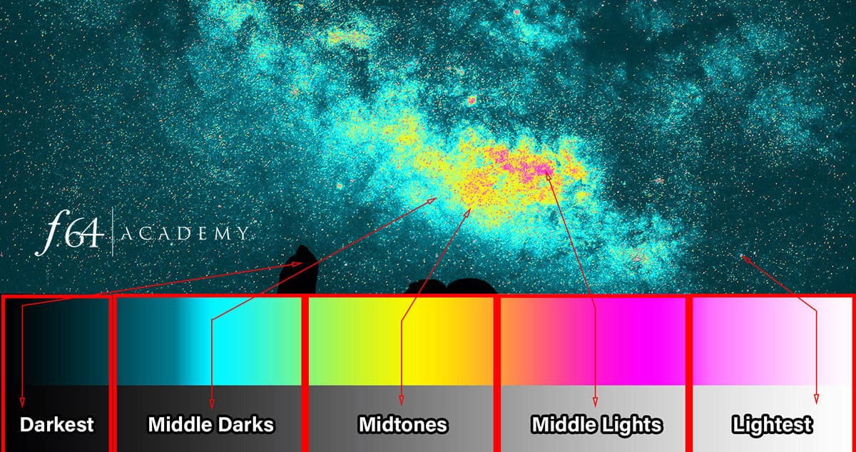
The 5 Tone Heat Map resulted from the need to visually see our tones to interpret them better. What the Heat Map does is analyzes the tones in your image and applies a map to the tones. The colors are bold for a reason. With these bright colors, the tones scream at you. They let you know exactly where they are with a color-coded map.
While this may seem like an obvious “ah-ha” moment with the Gradient Map, this is a breakthrough for post-processing. With the Heat Map above a Curves layer, you can see the “heat” changing as the curve moves. This lets you see in a color-coded visual display just how much of each tone is visible in the image. Not only that, but you can also use the colors to make an exact Color Range selection.
Since this concept is relatively new and foreign to many users. I have developed a video for you as well as an Action package to help you use it.

For Blake, it's all about the art and process synergy. He dives deep into complex topics and makes them easy to understand through his outside-the-box thinking so that you can use these tricks in your workflow today!


As usual, Blake knocks our socks off with more amazing ways to enhance the photographic image.
I will be up all night playing with this technique.
THANKS Blake!
🙂 Ooops! Didn’t mean to keep you up all night, haha! Glad you enjoy it as much as I do!
Tried downloading the Action but a blamk page appears with nothing else.
It may be a page load problem. Give it a few seconds it should pop up.
Tried downloading the Actions but after clicking the button, a blank page appears with nothing else appearing.
Hmm, give it a minute it may be a page load issue.
Blake, I still can not get the Action, I have waited 5 minutes and still a blank page
Did you try another browser and disable popups?
Wow….very informative and definitely something I plan on implementing.
Thank you for creating this action & sharing it for free. You are a generous genius 😉 !
It is always my pleasure. Thanks for watching!
Hi, Blake,
Loved your totorial on heat map, found it very interesting. Although I understand what it is, could you show a few more examples on images. Maybe a landscape or portrait
Thanks
Because this is still in its infancy stages I am still playing with it. I haven’t really had the time to create more content with it. I would suggest experimenting with it since you already have a good understanding.
Wow! McPheeters is right. Blake is amazing with his tutorials.
🙂 Thanks, Maria!
Can this be used in processing
images of birds and wildlife?
Always enjoy your Videos and your knowledge that
you are so willing to share with others.
Thanks
Sure can, it can be used on any photograph with tone 🙂 that’s just about any photo 🙂 You just have to experiment with it.
I wish you had used an example that more of us shoot. Tony’s suggestion?
Replace the Milky Way with ANYTHING that you want to express the tones in. I used a Milky Way because it is the hardest of all images to process.
May I go on to say that you must understand my frustration with this comment here. It makes me feel as if giving away killer content and free actions is never enough. At some point, I have to say that I CANNOT cover everything for everyone and I would appreciate it if you could think outside the box and the scope of this single tutorial.
Check out Arron Dowling ADP Pro 3
Ah, interesting! I didn’t know this existed anywhere! Great minds think alike. However, his heat map is restricted by a pixel layer, not an adjustment layer that changes as you make adjustments. This is much more versatile. Thanks for bringing that to my attention.
Hanging around you (at least in digits) is really worth my while. Can’t wait to see what you come up with next. Thanks!
🙂 Thaks for sticking with me 🙂
Gracias por tus enseñanzas y tu explicación correcta lo voy aplicar en todas mis fotos.
This is cutting edge and revolutionary. Thanks Blake. Visualization of the tones using this approach will radically change the ability to enhance pictures and get the most out of each one.
When I see this type of innovation, I’m proud to be a F.64/Academy subscriber. My trip this past Fall to Moab has me with a lot of night pictures (Milky Way was not hot then) that I can’t wait to use this for…plus my many other wildlife pictures to squeeze out as much varied tone and color as possible.
Fantastic! I couldn’t be more excited or proud of your work!!
Thanks, Joe! You will find this trick invaluable with Milky Way post-production! It is quite fascinating how much we miss in that beautiful gassy center!
A few days back I was practice processing a white wooden beach chair on snowy Lake Super Shore with a few golden grasses poking through the snow with a bit of cyanish-blue Lake Superior peeking between white ice flows. Lots of shades of white.
I set it aside because I didn’t like what I’d done. When your heat map video came along I reloaded the image, applied the heat map and with one curve adjustment got a better tonal range to move ahead.
You did an outstanding job in presenting your 5 Tone Heat Map. I downloaded it, and plan to try it out in the next couple of days. Your are one of my favorite people to watch when it comes to editing a photo. Keep up your great work.
Great video, I am so using this to reprocess some of my night sky images. Thanks Blake.
Awesome! Glad you found it useful also.
Is this just a different way of breaking up your Zone System into 5 zones vs the 10 or 11 in your Zone Express system. The concept looks interesting and I’m just trying to discern the differences. Thanks Blake for the info.
It is a more organic way of looking at masks. The Zones are restricted to actual data at the time of the image. This is a fluid way of making masks based on how the tones shift under the heat map. It allows you to dial in what you want to select using the color ranges. It is not necessarily better, just another way of obtaining a killer mask!
Holy Moly! Blake, you are a flippin’ genius! This is so awesome! I think I stopped and rewound different parts a dozen times to grasp it, but, grasp, I did! I thank you!!
By the way, in space, there is a redshift and blueshift, where the objects appear as colors of the spectrum, based on their movement. Objects moving towards us are in the red end of the the spectrum. Blue appears as object is moving away. This might be useful on the colorization of the Milky Way.
Just saying. LOL
Thanks for all of this, the video and the action!
Su
So cool! I love learning new things! So Purple… would that be somewhere in between 🙂
Interesting point. Actually though it’s the opposite. If the object is moving toward us, the waves are compressed, so their wavelength is shorter. The lines are shifted to shorter (bluer) wavelengths. Blake, this is an awesome tool. Thanks!!!
I’ve been doing this for some time but without the color coding. The color coding really makes it faster and easier. Thanks for sharing this and especially the actions. I always look forward to your Friday tutorials.
Awesome! Glad I could help!
Thanks Blake. I continue to wonder how to combine creatives such as you (usually artists) with scientists and engineers (you likely are part of these folks also), I think I am dominated by data. Again, both are important, especially as our son has an engineer bent and not enough creative; but he is only 18. The borders should not be.
I never thought of myself as an engineer, interesting!
May I say…stellar! 😉 And so generous with the free actions. Head is spinning, and at my skill level I’d face lots of rewind/replay, but can’t wait to try this. Looking forward to how you incorporate this into the Zone System Express.
Nice! This is another pretty cool one Blake. you had me chuckling at “gargle”. That is a highly technical term right? I generally feel better if I gargle every morning.
This absolutely blows my mind. Utterly brilliant! Thank you,
Dear Blake, you are the dai sensei of Photoshop. Honestly I know of no other who breaks down the art of ‘colouring’ images like you do. I’m in awe of your knowledge and talent using Photoshop and can’t wait to practice what I’ve just learnt from you today. Happy 2018 to you and yours.
Can you use your heat map in other Editing Software like Topaz Studio?
Thanks for a great idea
It won’t work in their software, only Photoshop
Hi Blake,
I also have problems with downloading.
After several attempts and waiting times of 30 minutes, I still could not download the folder. I hope you can help me out whit this because I realy want to try this out.
Greetz from Belgium
Try another web browser or if you have an ad or popup blocker, try turning it off for that page.
Hello Blake,
Can’t get the Heat map downloaded. I waited for over 5 min but nothing happend.
Eb
Try another web browser or if you have an ad or popup blocker, try turning it off for that page.
The download link goes to a blank page.
Try another web browser or if you have an ad or popup blocker, try turning it off for that page.
Just a quick follow up: for some reason the download page doesn’t display when I use Firefox but does when I use Safari. I successfully downloaded the action file with Safari.
thanks,
richard
—
Good, glad that worked. It is something to do with the integration of the email client. I am trying to keep everyone who downloads this in a specific group to update them when this will be available and integrated into the Zone System Express 5. I have started coding it, but still have a while to go before it will be ready for release.
VERY cool, Blake! Happy New Year, my friend!!!
Hi Blake
Thanks so much for sharing your knowledge with us.
Best Regards
Louis Jordaan
Wow, as always, so much to learn and use. I’m going to go back to a photo I took in Amsterdam years ago with my Pentax film camera to see if I can get it ready for printing finally! Now with the Zone System and Color Mapping, I believe I can finish.
You continue to amaze me (and probably many others, too) week after week and I am most grateful for you sharing your knowledge with us and help improve our photography. I’ll be sending you a little gift in the mail soon. Thank you, again!
You always come put with some extremely useful techniques, Blake. Thank you.
A problem: where are those actions you mention?
Javier
Here you go Javier: http://f64.co/heatmap
Just be sure to go into a different browser if the page does not load. I have heard Firefox can be a problem on some machines.
Blake – Can’t thank you enough for this and all the other great tutorials you provide for us all to follow along and learn from your expertise. This is revolutionary stuff and I cannot wait to see where it goes under your instruction…
Awesome! Let me know what you think about it. I’d love to hear your thoughts after you’ve had some time to experiment.
Blake, I am thoroughly impressed. Your analytical, scientific approach to Photoshop editing should put you in the Photoshop editing hall of fame, if there is one.
I used to be a scientist. The way you think, makes fuzzy concepts really clear for me.
I am especially appreciative of the 5 zones. Seeing tones is really difficult for me. This should help a lot. I never do landscapes. But your methods apply to everything I photograph and also my digital art.
Thanks, Cheryl! I think that Hall of Fame may be Creative Live 🙂 We’ll say that counts!
Glad I could help.
I have been watching you off and on since you first began. I am really proud of your determination and willingness to seek advice and make the changes needed to get your ideas across. You have slowed down your delivery and matured in many ways as a presenter.
I have thought your concepts and insights were remarkable from the very beginning, but your delivery was so fast, only the most attentive could keep up with you.
Now, I think your presentations have matured, and allow more people access to your exciting concepts. You have worked very hard and produced a great training product. Congratulations.
Cheryl
It has been a while hasn’t it Cheryl? Thanks so much for all of your continual support. It means the world to me. I don’t have this altogether on my own, but with your help and many others we are all better. That has been my mantra since the beginning. I have tried not to lose sight of that and am grateful you still see that.
The presentation side has gotten a ton better over the years. Man, was I 60 miles a minute before, haha! Teaching live does tend to help with that. Seminars and workshops have shown me what the viewer on the other side looks like when you move too fast… deer in headlights 🙂
I think I still have room for improvement, so I am working on that. I appreciate all of your insights and advice over the years.
I have been following you for several years and totally see you as the guy shaking up the whole field when it comes to using Photoshop. I use your techniques all the time. This tutorial is brilliant – would never have thought of doing this without your guidance. I have already tried it on a couple images and it is amazing! Thanks for sharing.
It’s so wonderful to learn 5 Tone Map in such a short and informative video–I thoroughly enjoyed it. This is another spectacular innovation of yours. I cannot thank you enough for the contributions you made to the community and photography. I am very happy to be part of the f.64 Academic Elite group–worth every penny. Learning from you and from the beautiful works of other members in your CC sessions helped me greatly.
I was wondering if you do anything with a milky way image in camera raw before you bring it into photoshop in order to help the heat map to separate the zones.
I’m asking because I have you Photoshop bootcamp tutorial from creative live and it has this image there. (It could be same image with different camera settings.) But when I load it in photoshop it starts out with a different heat map. I have processed it a few different ways in camera raw. I’ve found that creating a larger separation between blacks and whites has helped. I was wondering if that is true in general for milky way images but I don’t have enough images to truly know.
PS. Thanks for all the great information here.
Blake, I will never process another milky way, waterfall or cave shot without using this technique first!!! This has to be the biggest OMG moment you have ever give me!!